Built for Disruption
Helping ambitious founders and growing companies create disruptive consumer brands that stand out on crowded shelves and connect with modern consumers. Specializing in food, beverage, and beauty, we combine strategic brand thinking, compelling packaging design, and category insight to transform innovative products into memorable brands. From concept to shelf, we create distinctive visual identities and packaging systems that drive attention, build loyalty, and fuel growth.
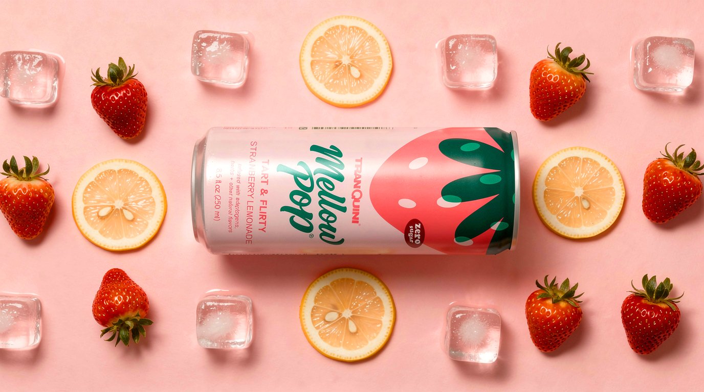
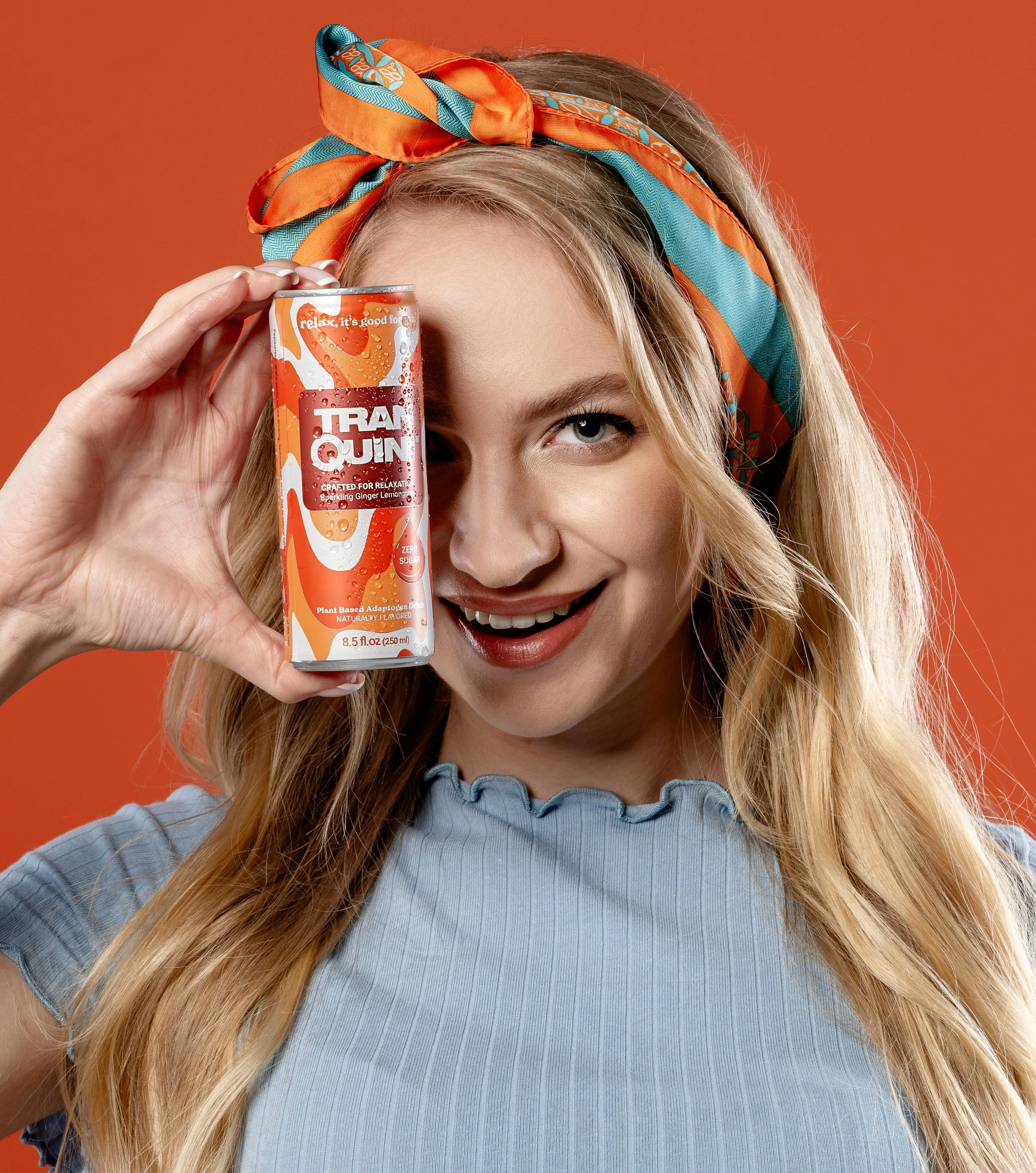
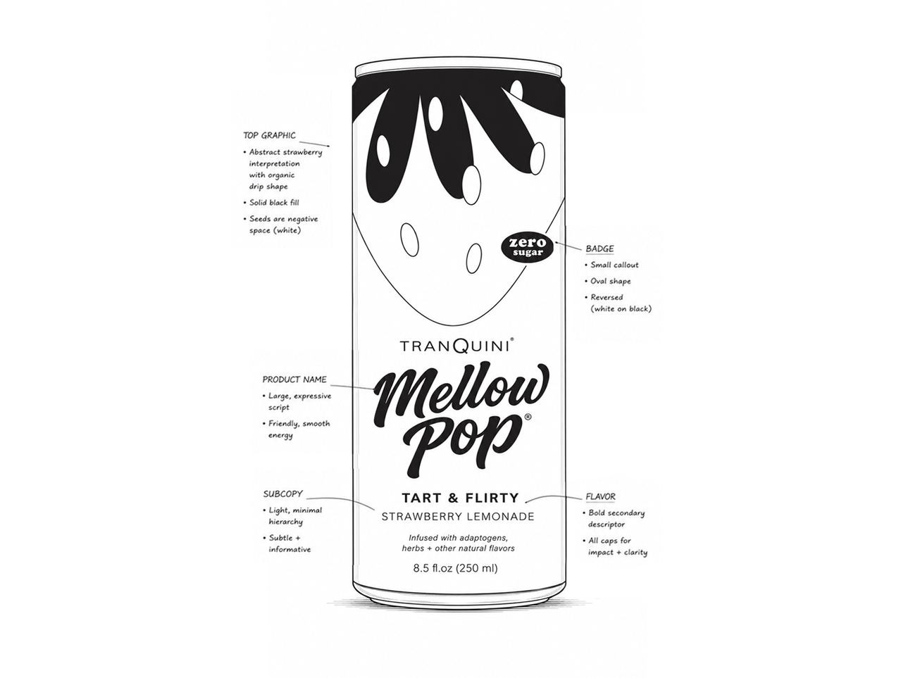
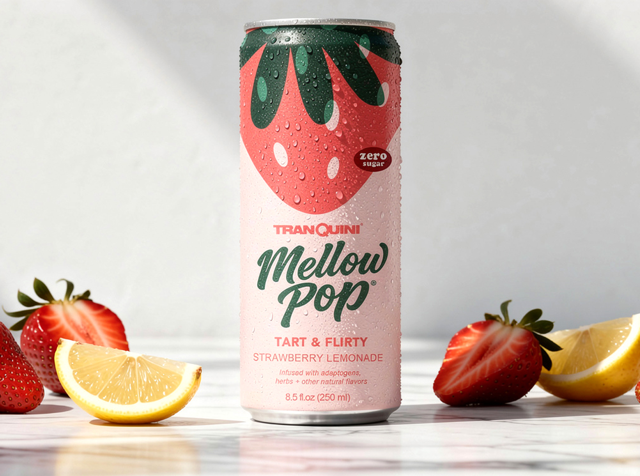
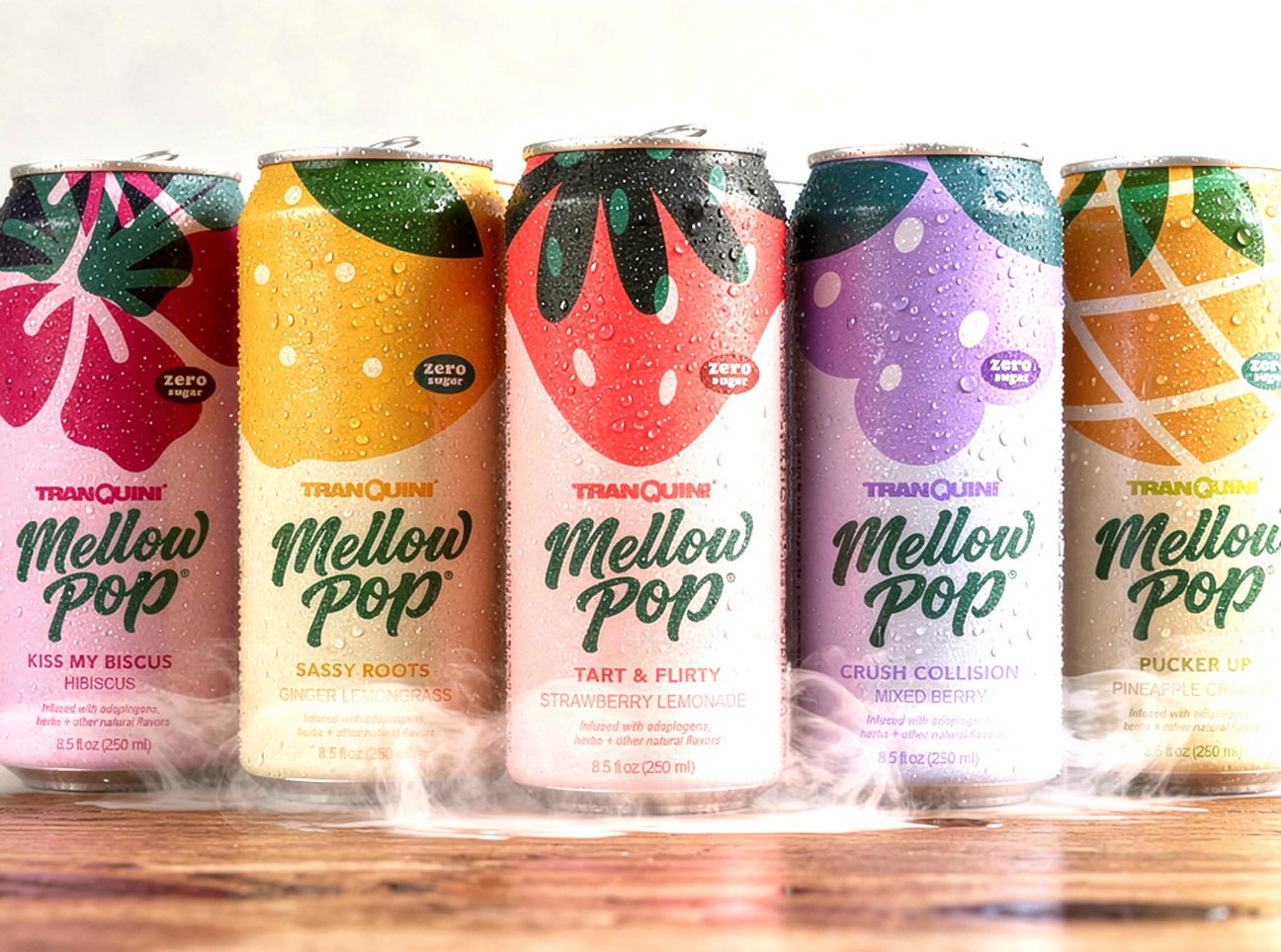
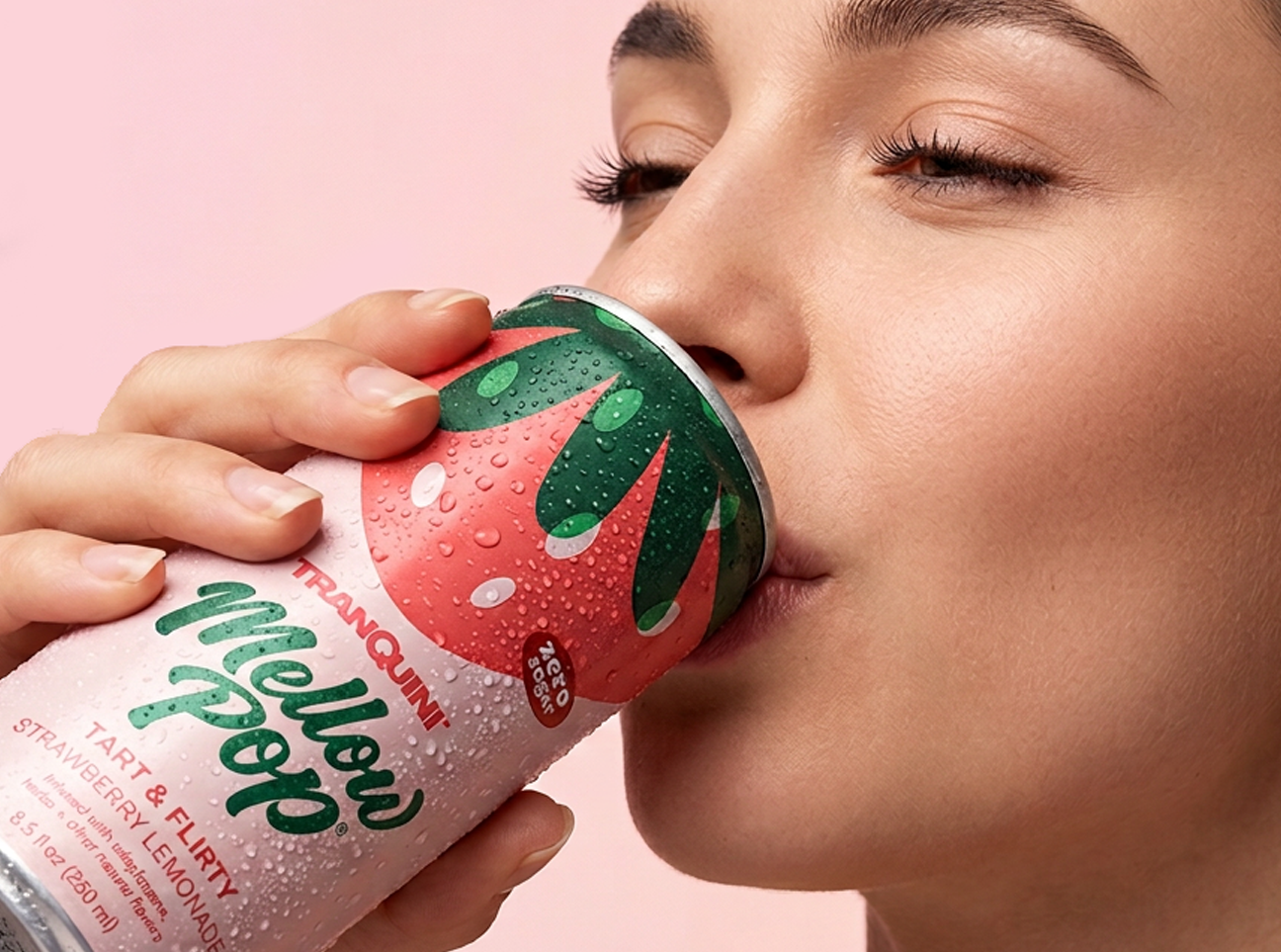
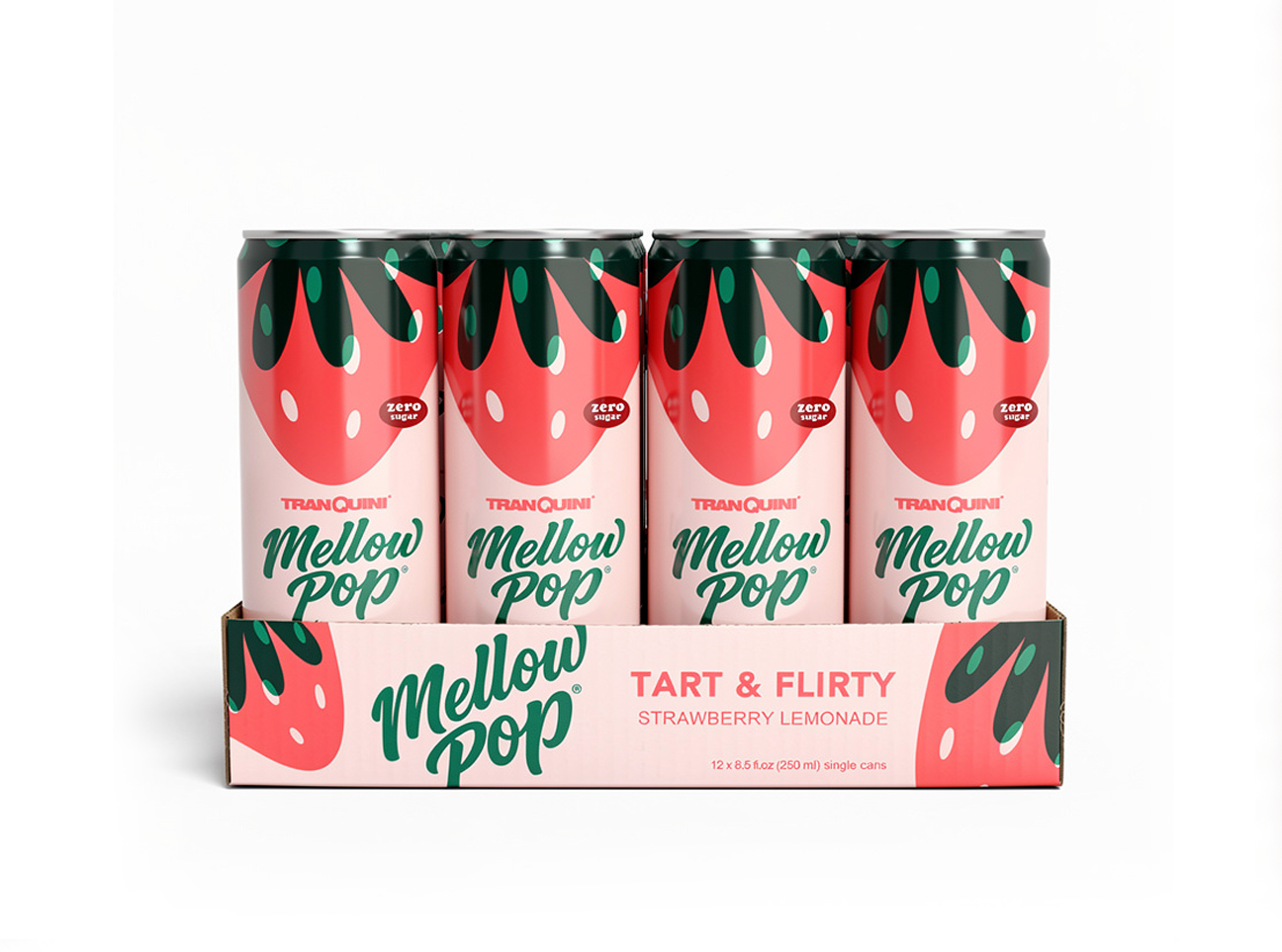
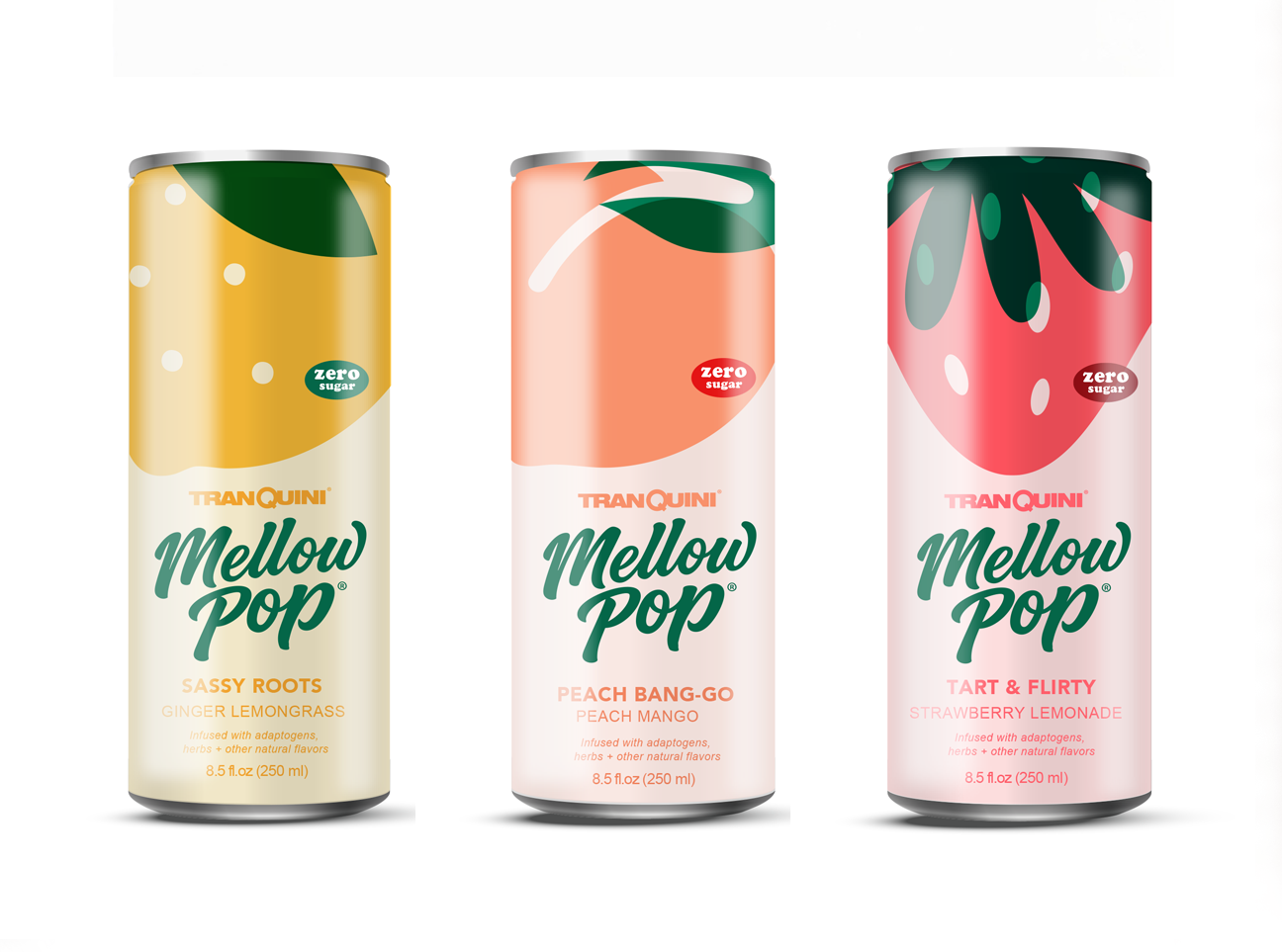
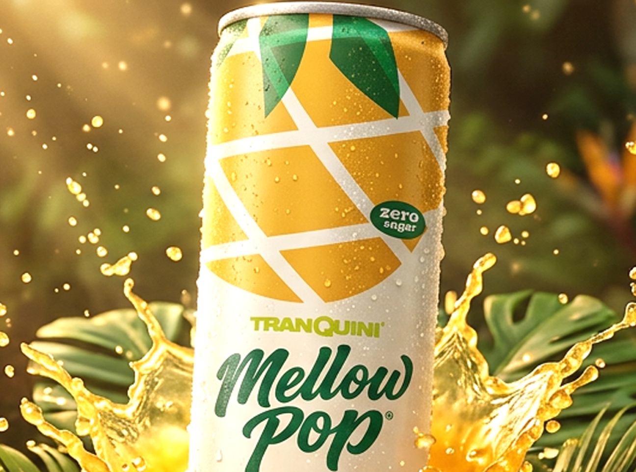
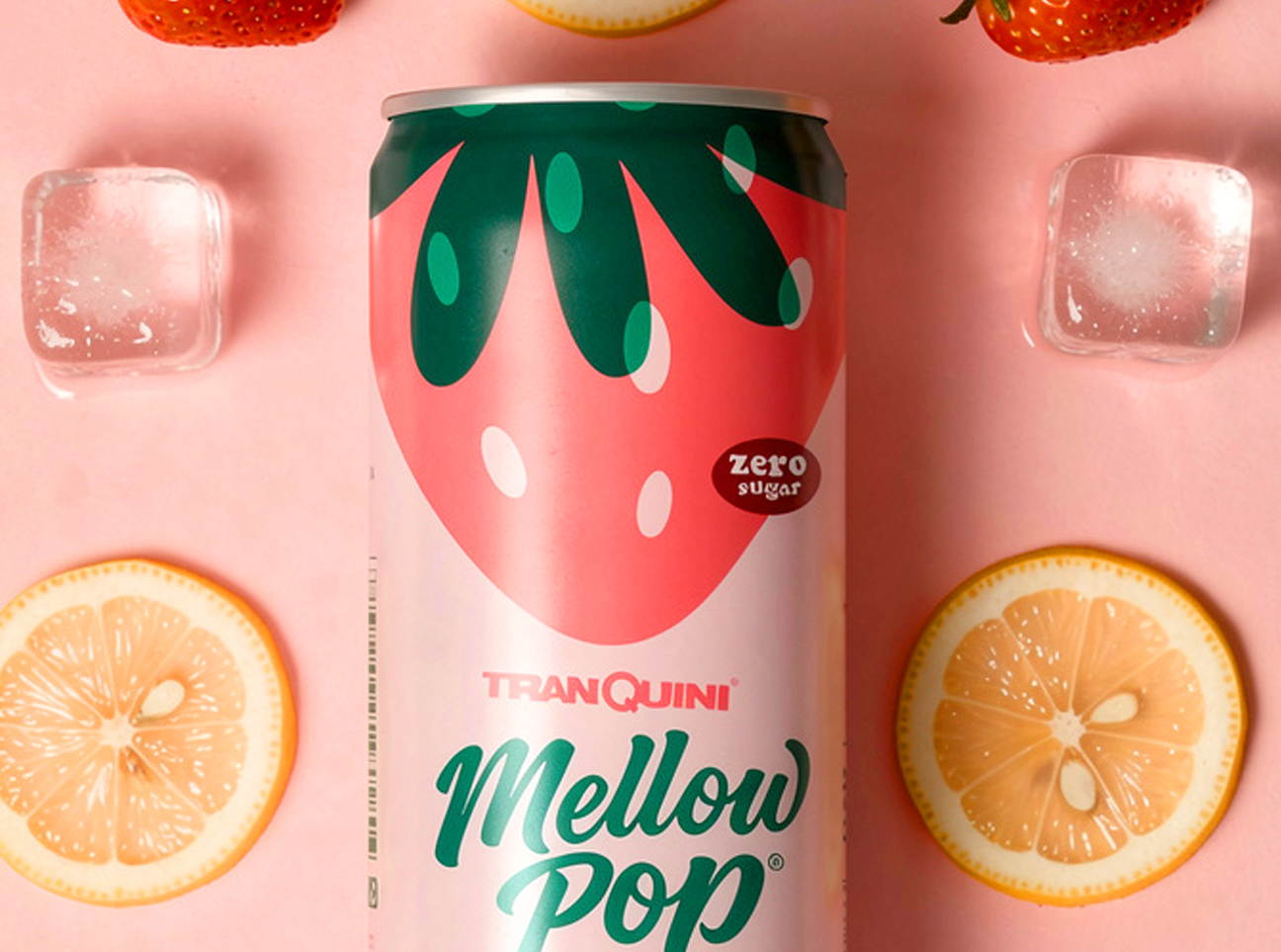
MELLOW POP
While the "Modern Soda" category has exploded over the past few years, most of the new brands lack a strong identity.
The objective was to reinvent, reposition, and refine the Tranquini brand with a strong, bold identity, a voice of relaxed confidence, and a dynamic brand language.
The result: A global launch in the UK and UAE.
Activities: Consumer Insights / Brand Design / Brand Positioning / Packaging Design / Brand Identity Guide / Website Design/ In-store Merchandising
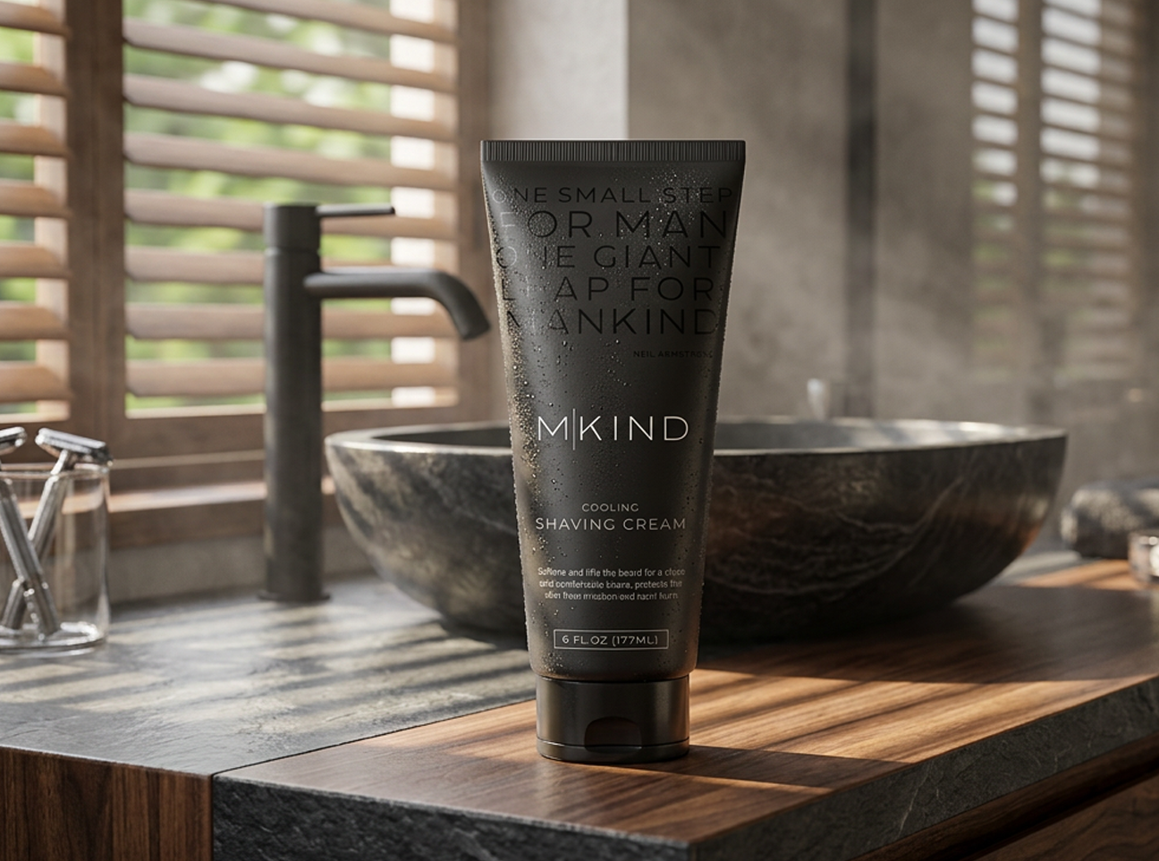
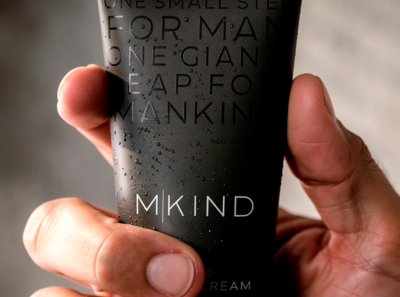
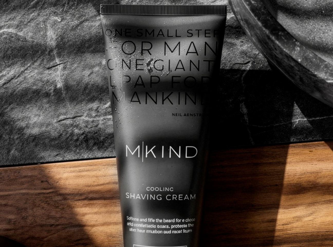
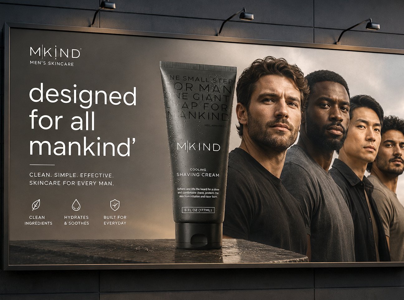
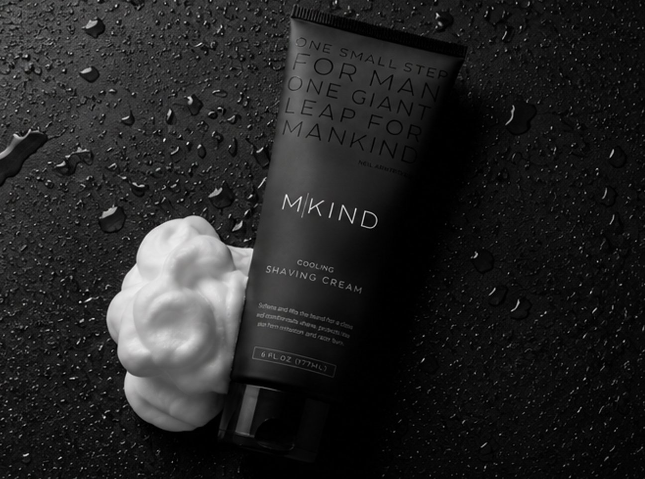
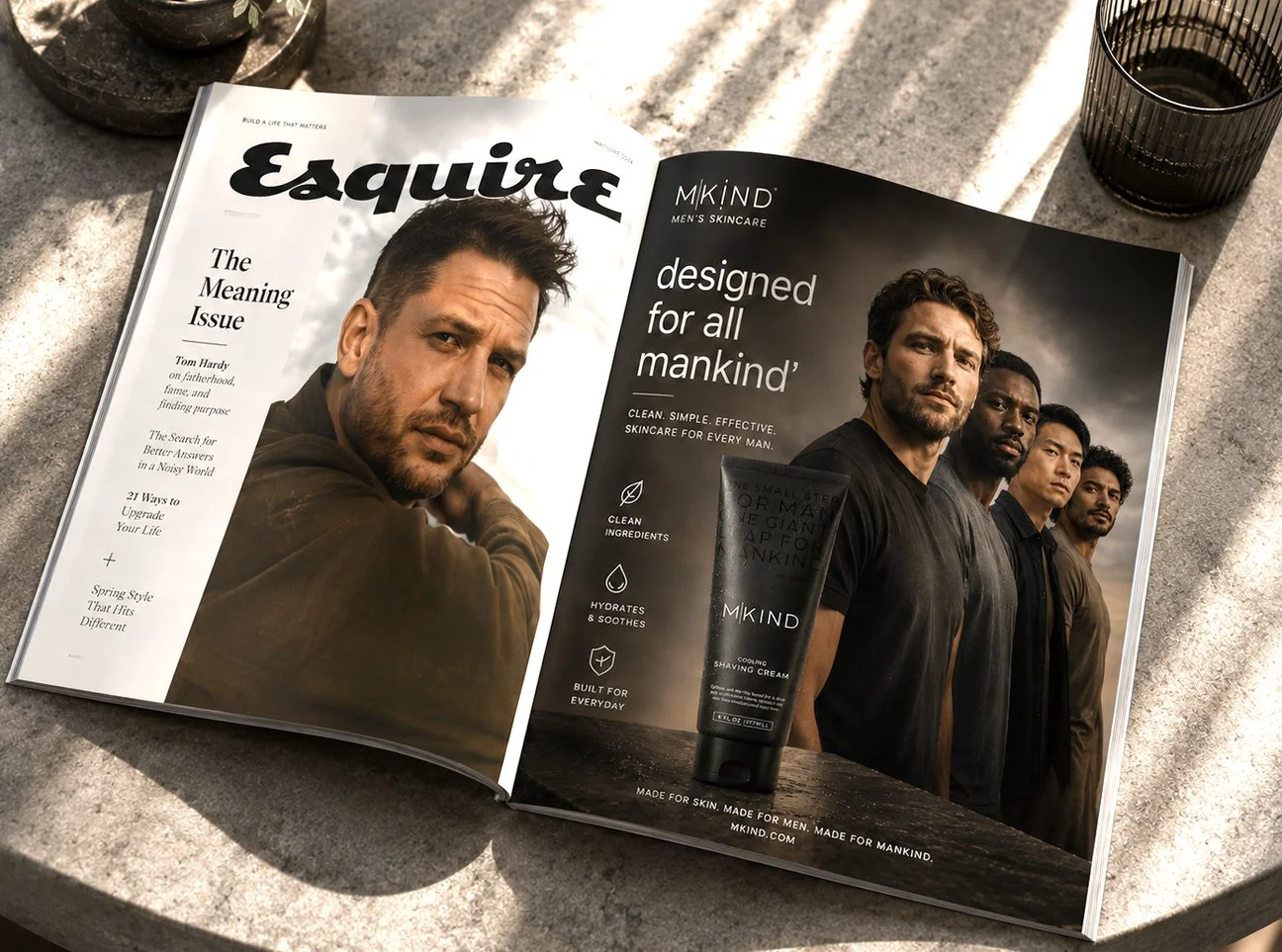
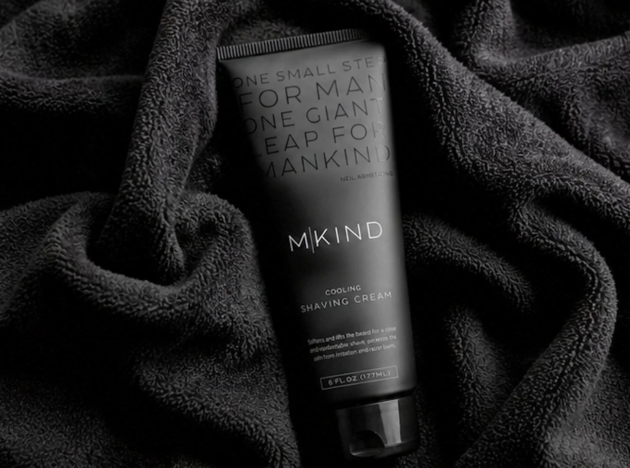
MKIND
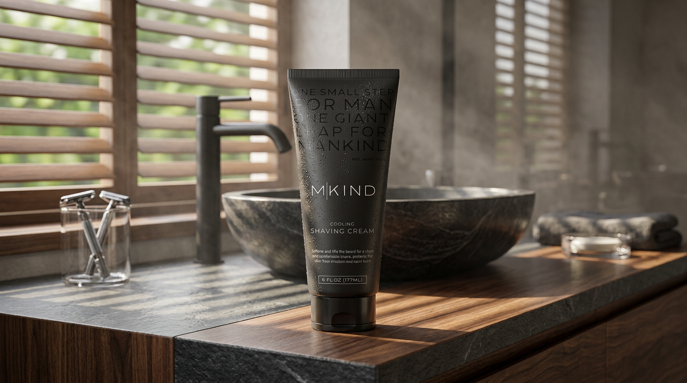
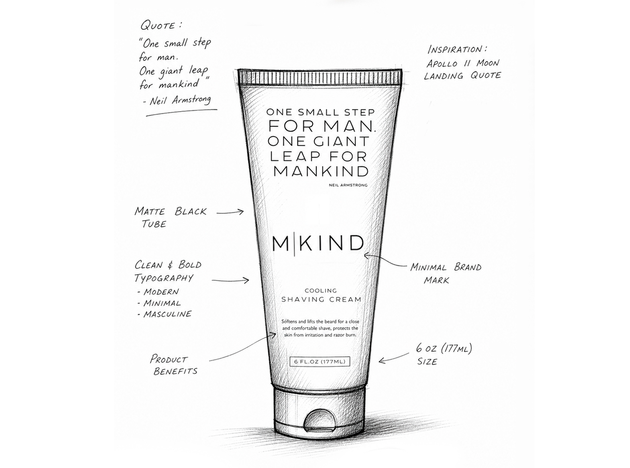
The name MKIND carries two meanings. It is shorthand for Mankind, but it also separates the "M" from "Kind” suggesting that masculinity and kindness are not opposing ideas, but inseparable ones.
The brand is built around the belief that modern masculinity isn't measured by appearance alone. It's measured by character.
Every product is designed to become part of a daily ritual, a few quiet moments where preparation becomes intention.
Activities: Competitive Analysis / Brand Design / Brand Language / Packaging Design / Brand Identity Guide / Advertising
A true creative innovator, focused on inspiring both clients and designers to play in the branding and design sandbox.
Executing the brand strategy with design that is meaningful to consumers, defines a category and drives financial growth is the key objective of my daily function.
NxtBar
Designed for the Next Generation of Healthy Performance.
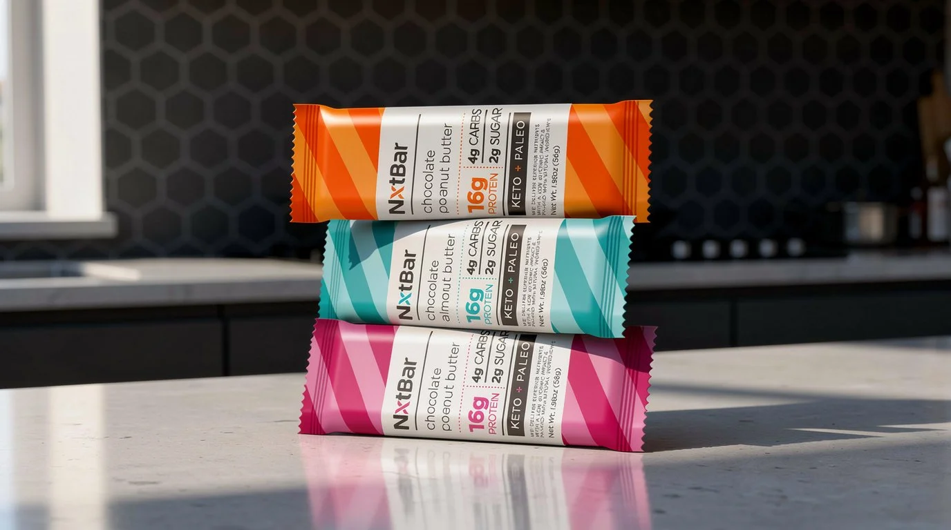
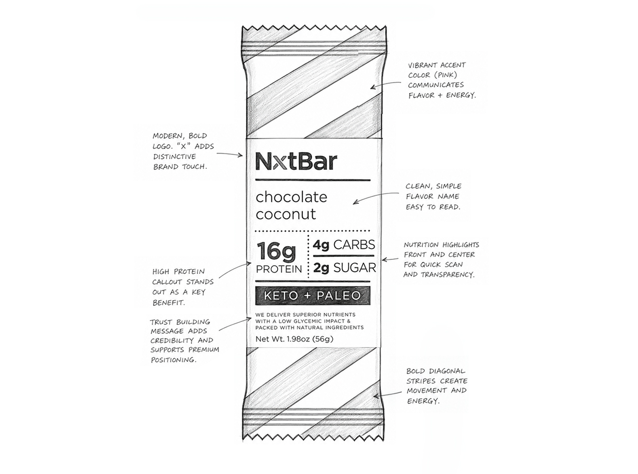
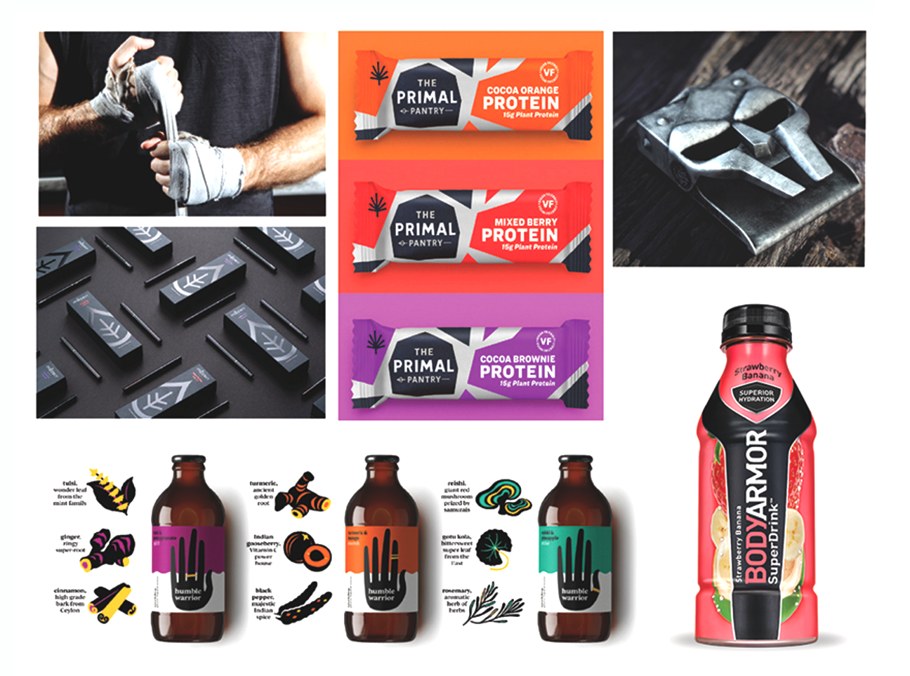
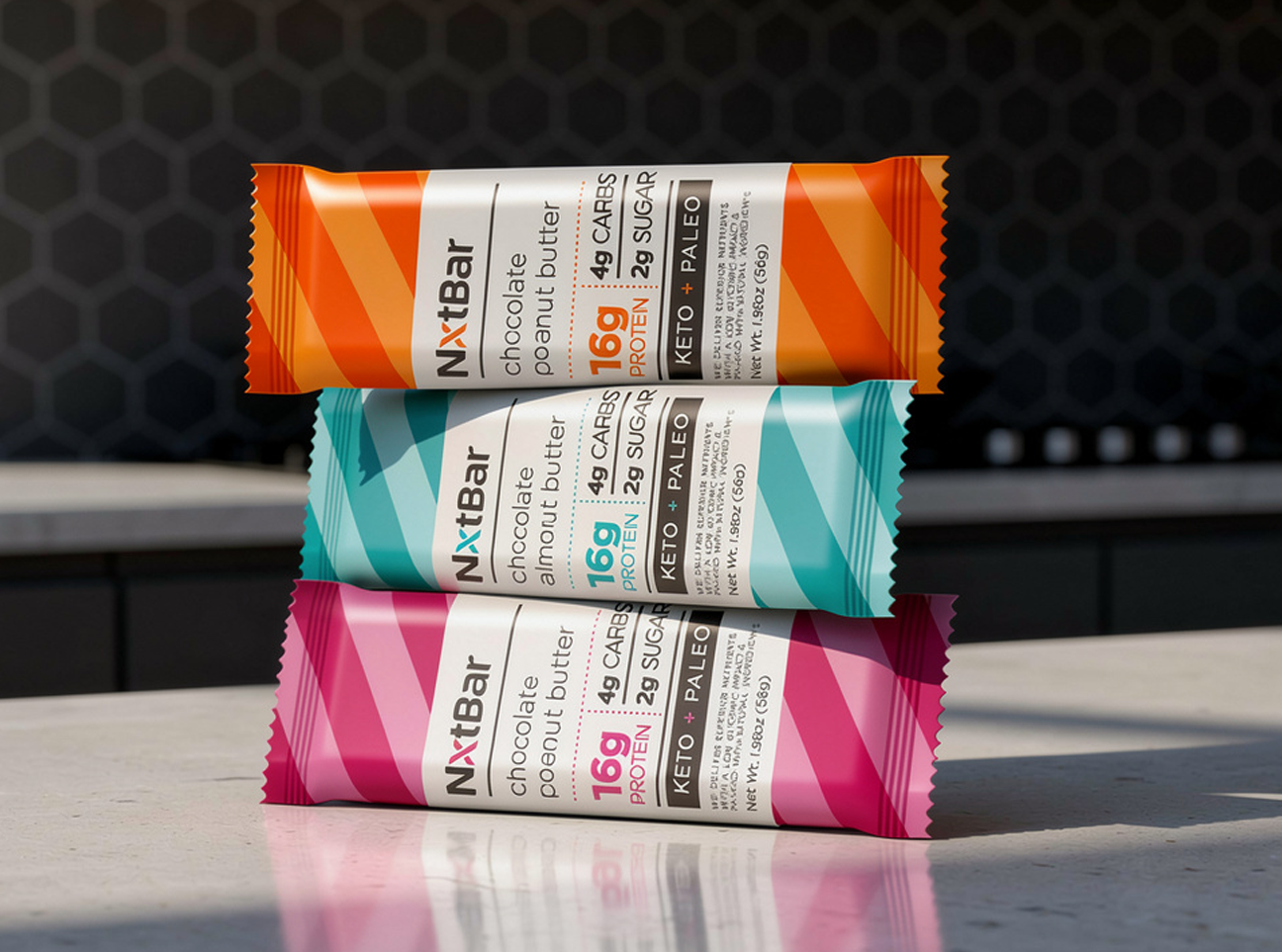
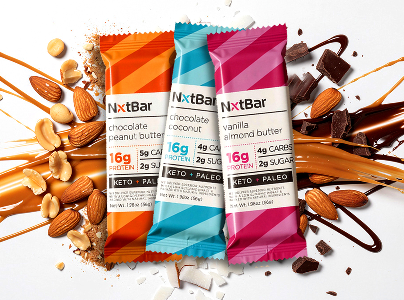
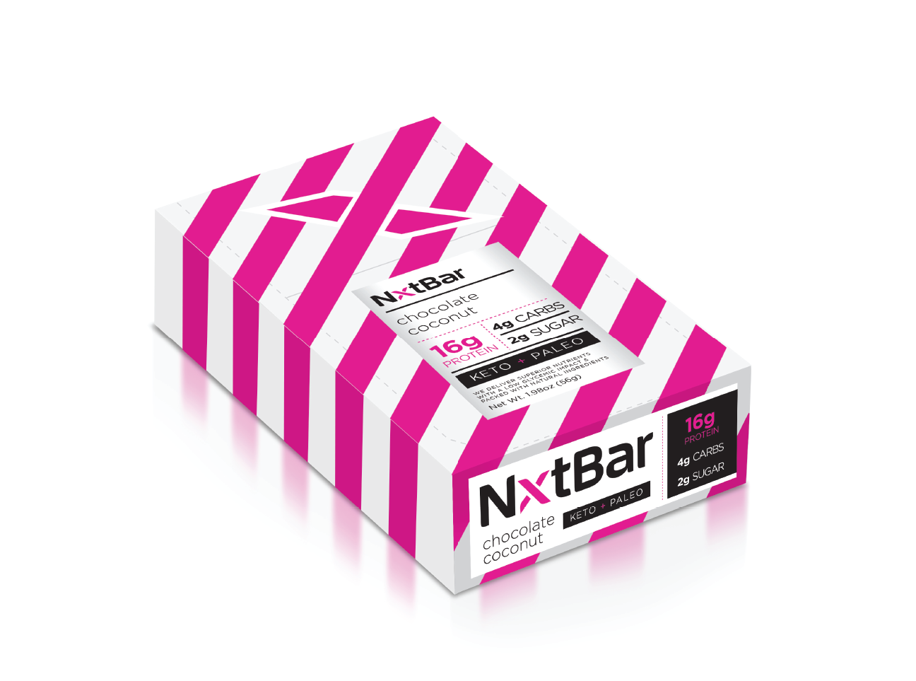
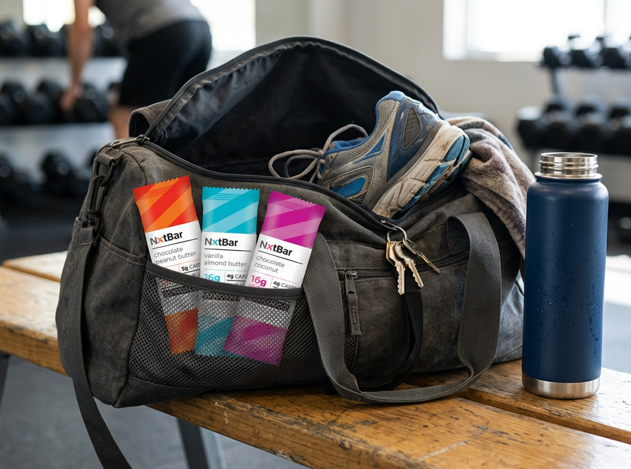
NxtBar is built around a simple idea: healthy nutrition should feel optimistic, energetic, and easy to navigate. Every design decision was made to remove friction, from finding your favorite flavor to understanding what's inside.
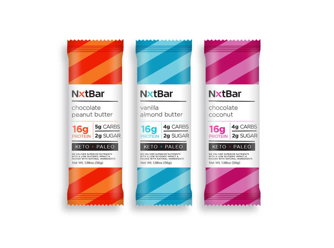
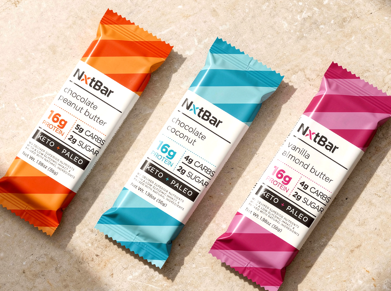
NxtBar represents what's next in functional nutrition. The sweeping diagonal stripes create movement, giving the packaging a sense of momentum and progress, mirroring the active lifestyle of the consumer.
Each flavor becomes instantly recognizable from several feet away while creating a striking billboard effect when multiple bars are merchandised together. Nothing is hidden. Nothing is exaggerated. Only the facts that matter.
Activities: Competitive Analysis / Brand Design / Brand Language / Packaging Design / Brand Identity Guide / Line Extensions
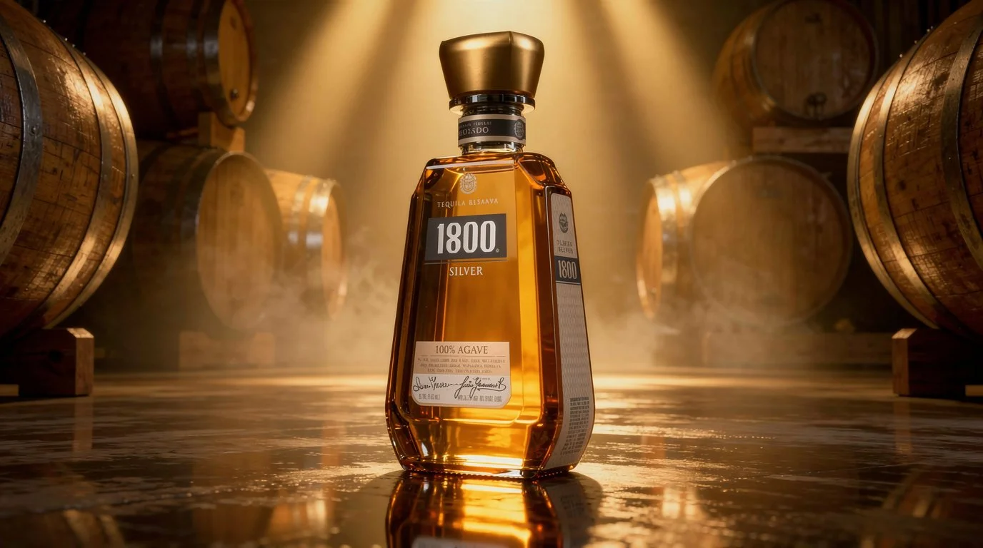
1800 Tequila
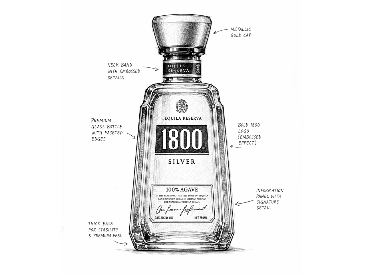
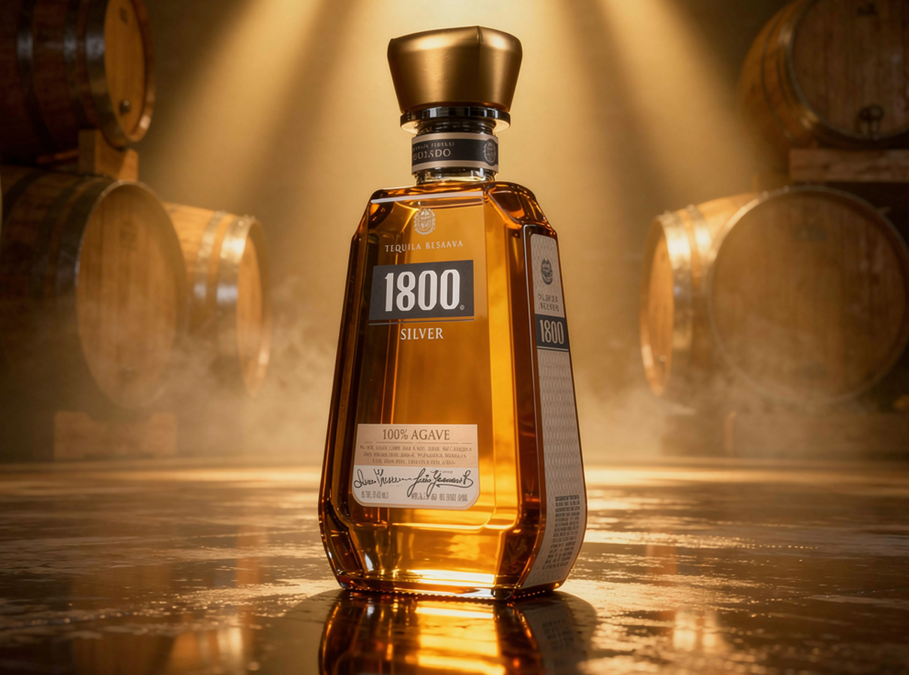
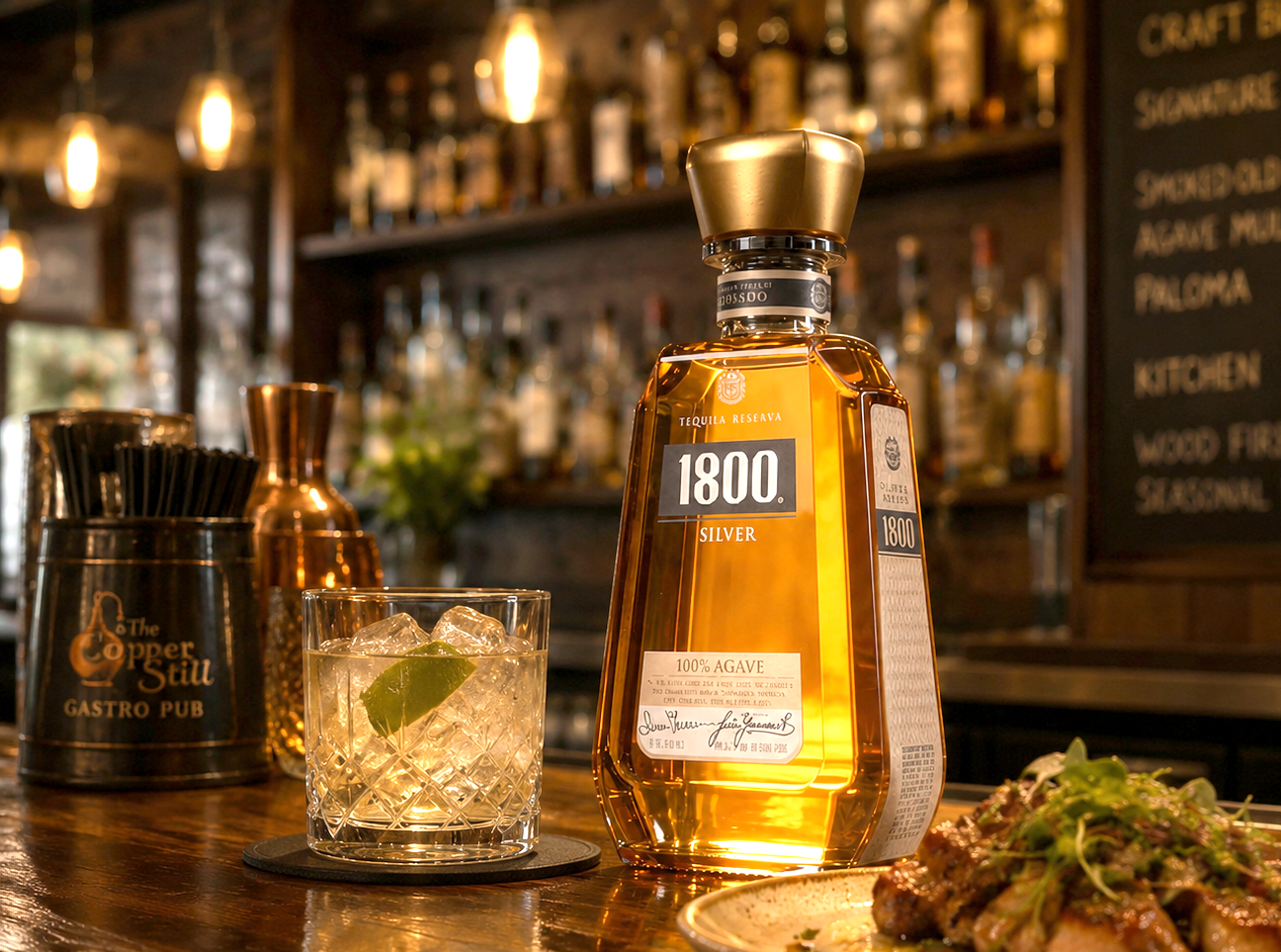
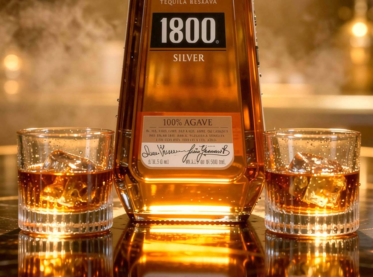
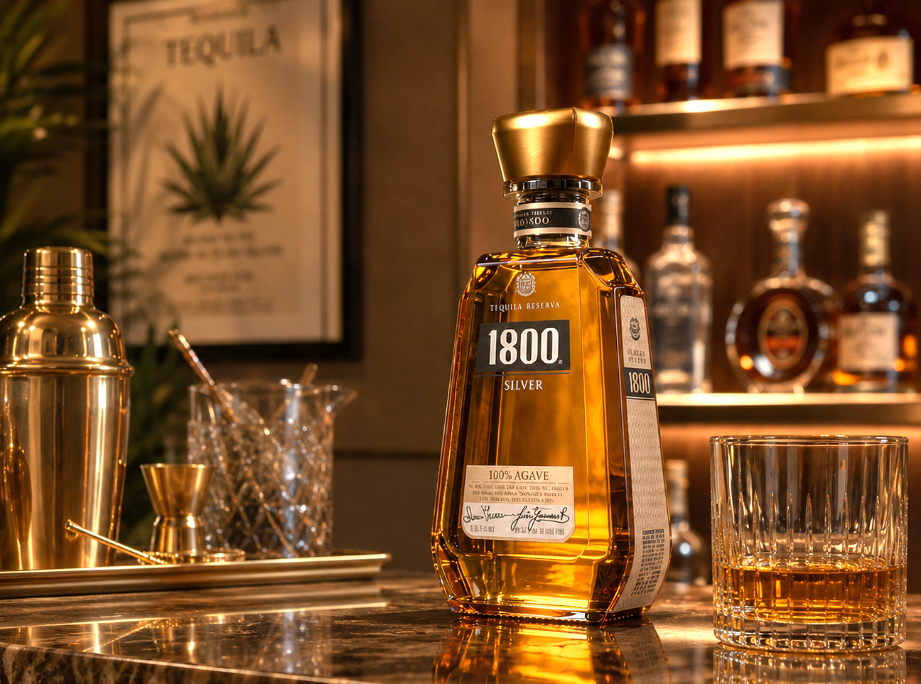
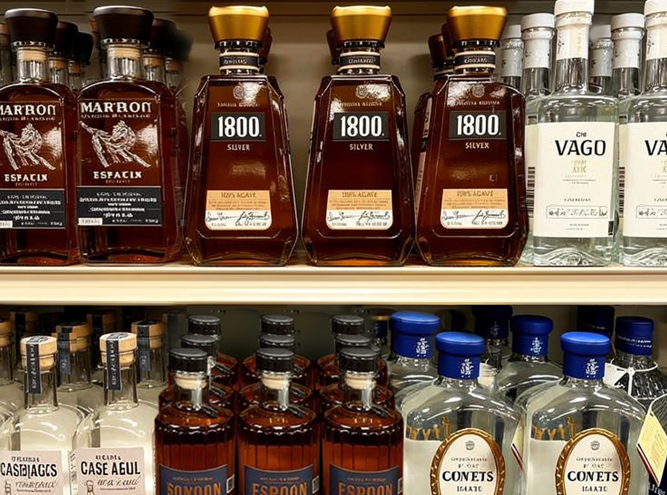
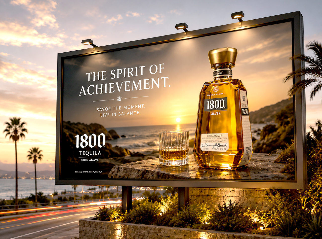
Inspired by the shape of ancient Mayan stone pyramids, the bottle features a strong trapezoidal form that conveys stability, craftsmanship, and authenticity.
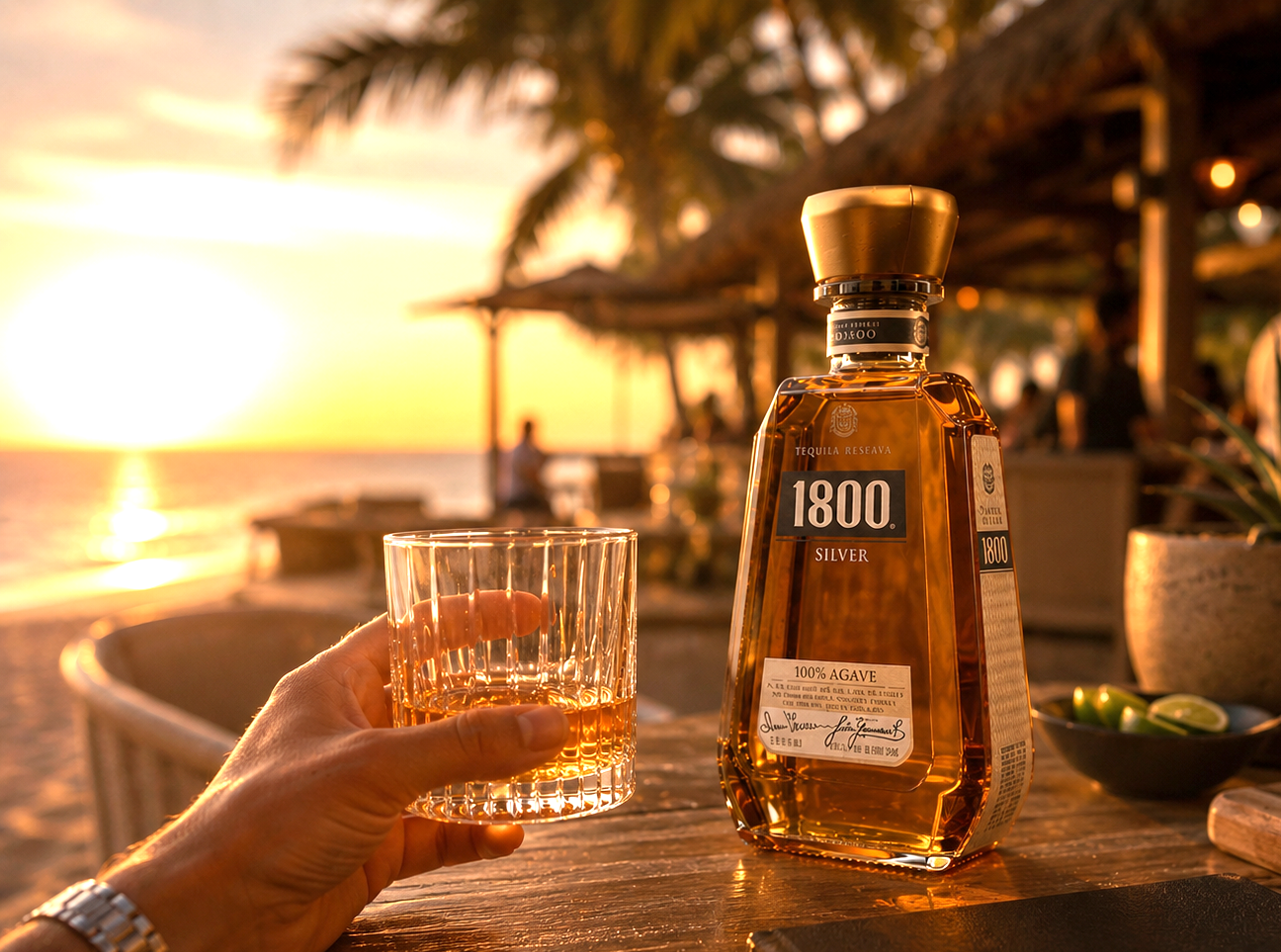
Every angle was carefully refined to create a premium presence on shelf, allowing the bottle to stand apart from traditional round spirits packaging while reinforcing the brand’s bold and confident character.
The label design was developed to balance heritage with modern sophistication. A restrained color palette, bold typography, and clean geometric structure were chosen to ensure maximum visibility and impact.
Activities: Competitive Analysis / Brand Design / Bottle Packaging Design / Label Desgin / Advertising
CAMPANIA
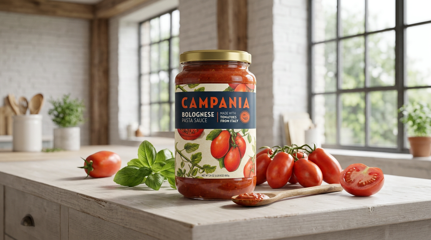
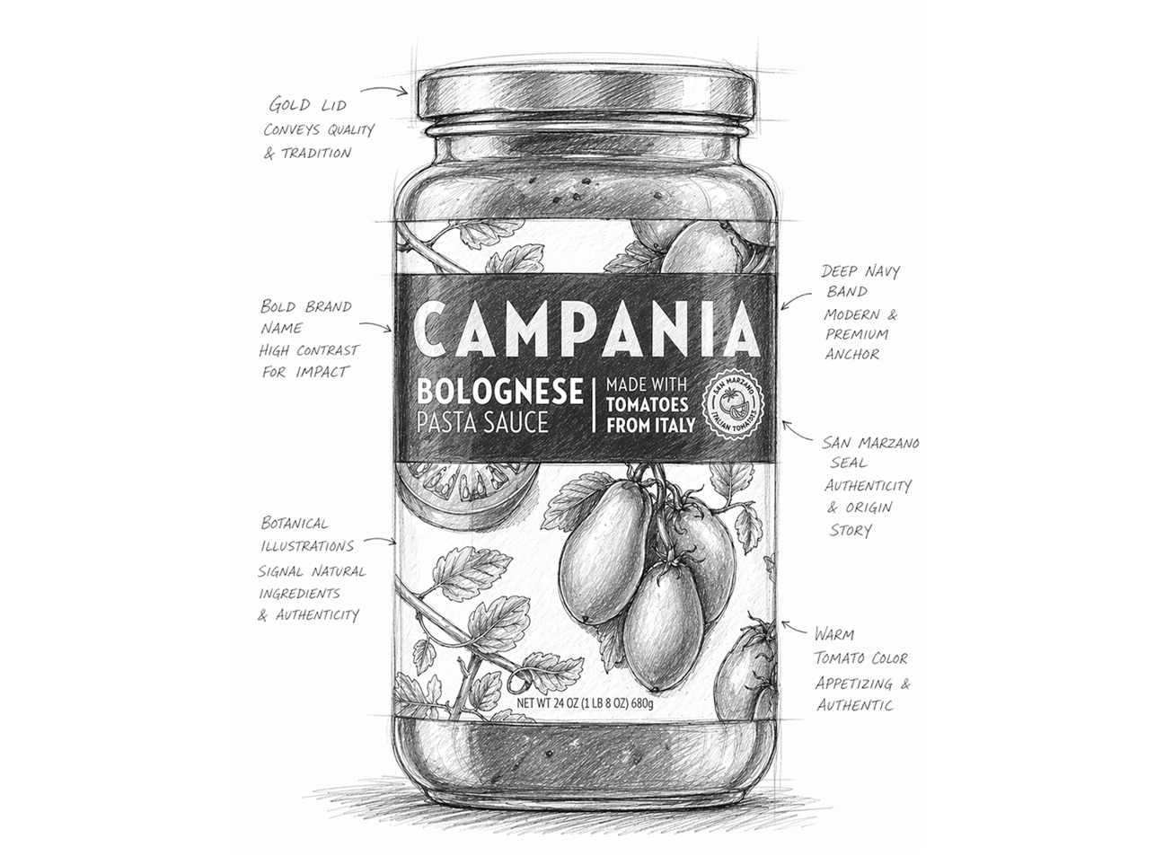
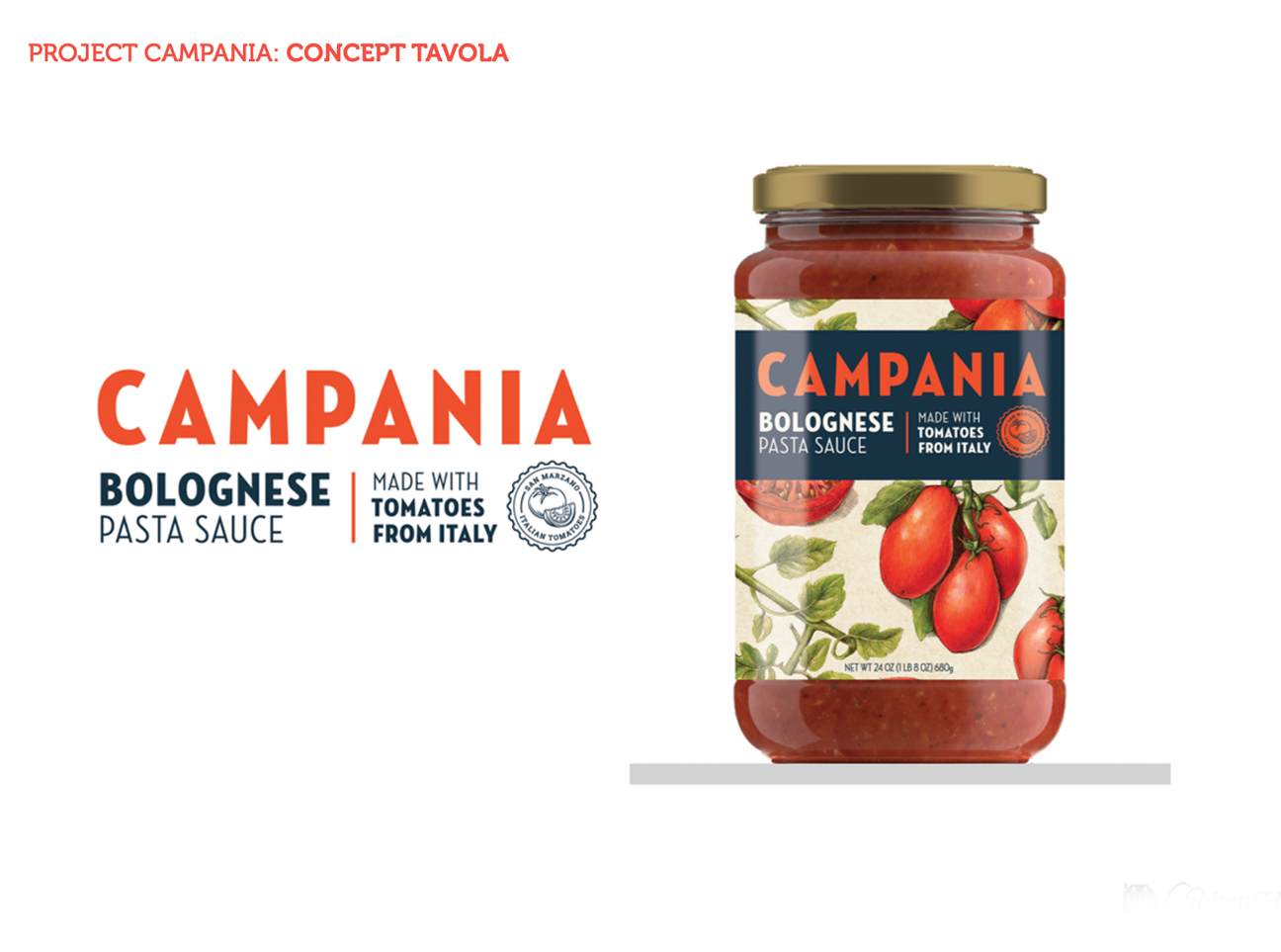
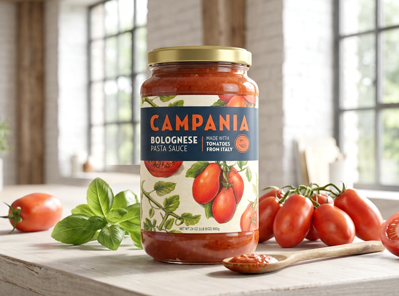
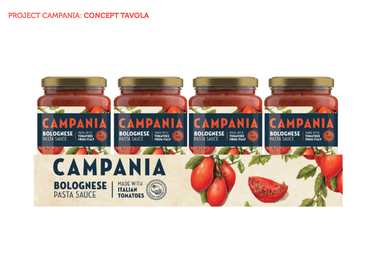
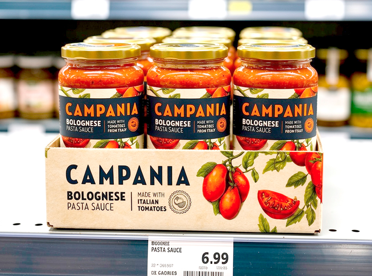
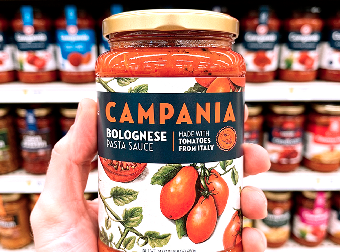
Campania was experiencing declining sales and was in need of a fresh look to communicate the origin and quality of the ingredients.
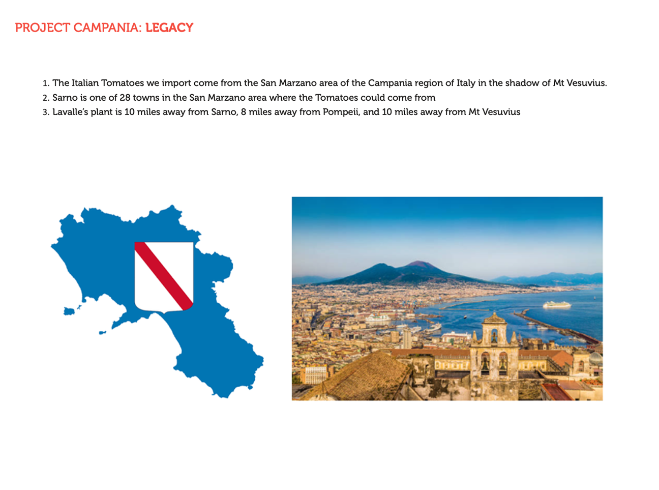
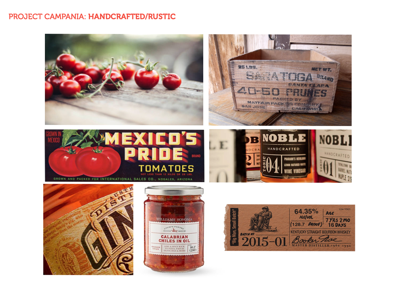
Category research and an understanding of the San Marzano area of Campania region in Italy inspired an artisanal approach and a bold, rustic and versitile label ousing appetite appeal.
The result: New distribution in Costo and other major US retailers.
Activities: Competitive Analysis / Brand Design / Brand Language / Packaging Design / Brand Identity Guide / Line Extensions
PATRICKS
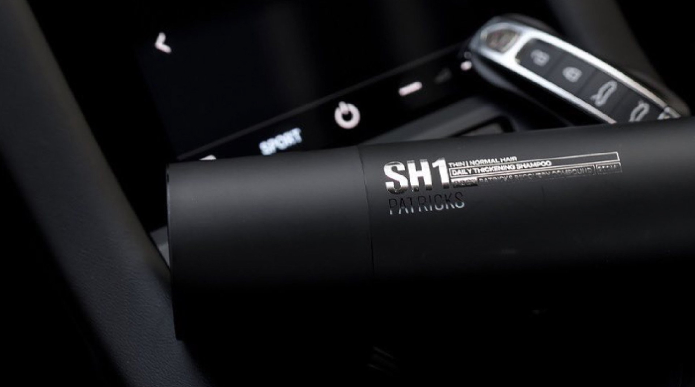
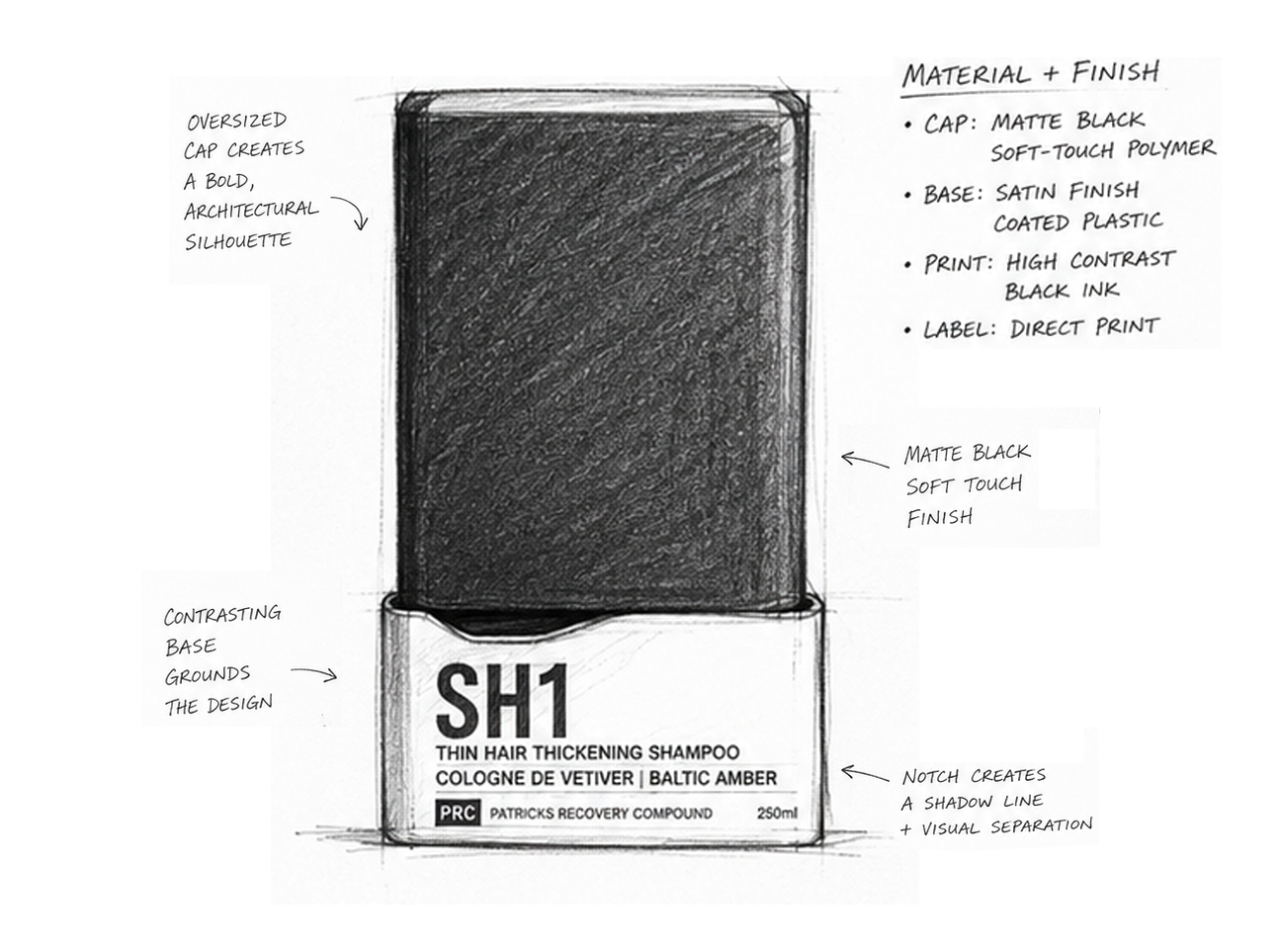
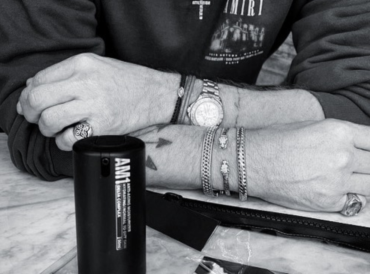
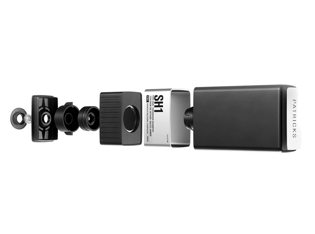
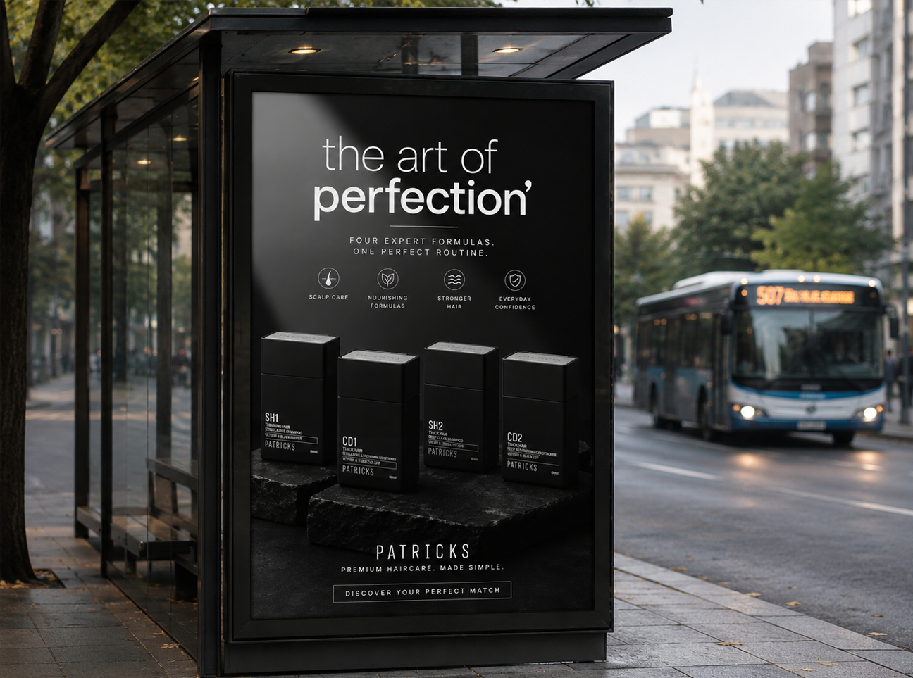
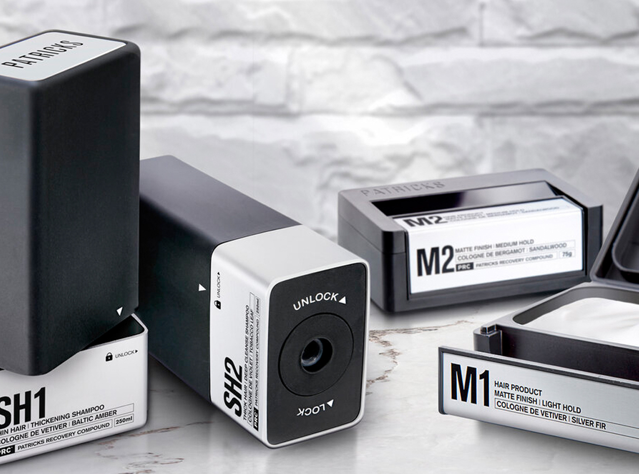
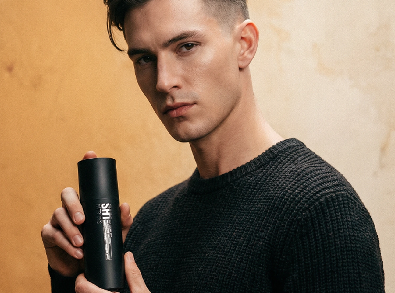
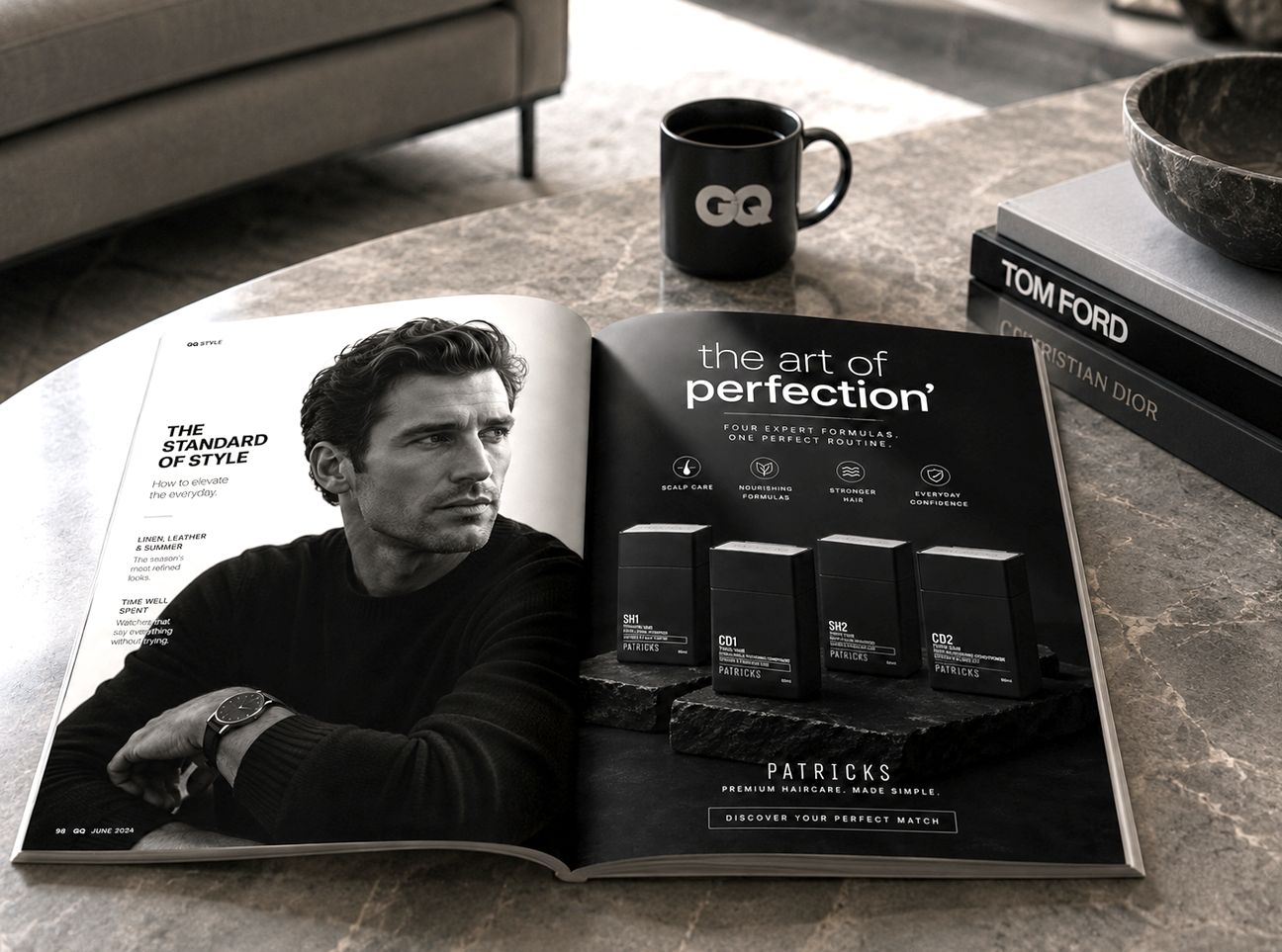
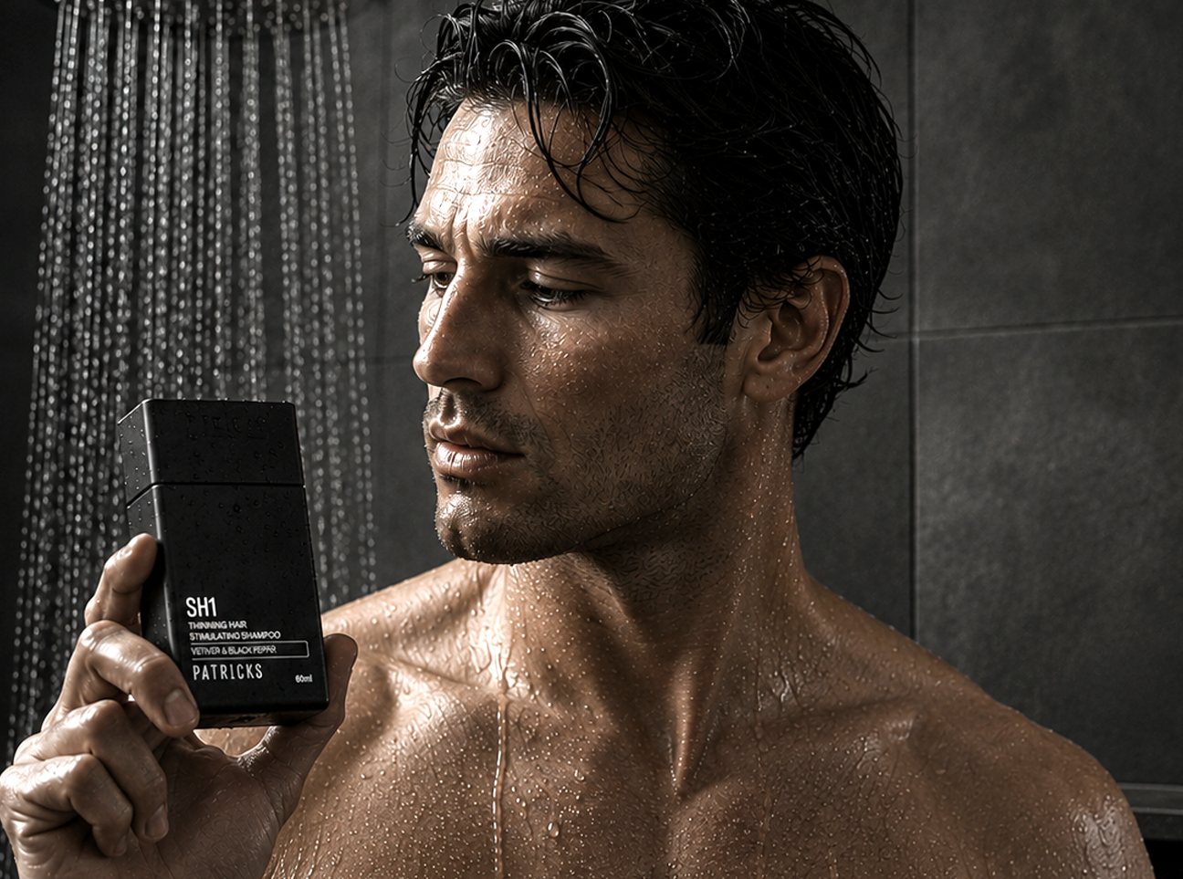
Australian entrepreneur and salon owner, Patrick Kidd was looking to develop an ultra-premium men's grooming brand inspired by exotic automotive detailing and handheld tech devices.
Attention to detail was a fundamental aspect of developing the PATRICKS line of prestige products, from the ‘click’ of the jar closure to the matte finishes on the bottles.
The result: Distribution in Harrods, Nordstrom, Oars + Alps
Activities: Consumer Insights / Brand Design / Brand Language / Packaging Design / Brand Identity Guide / Website Design
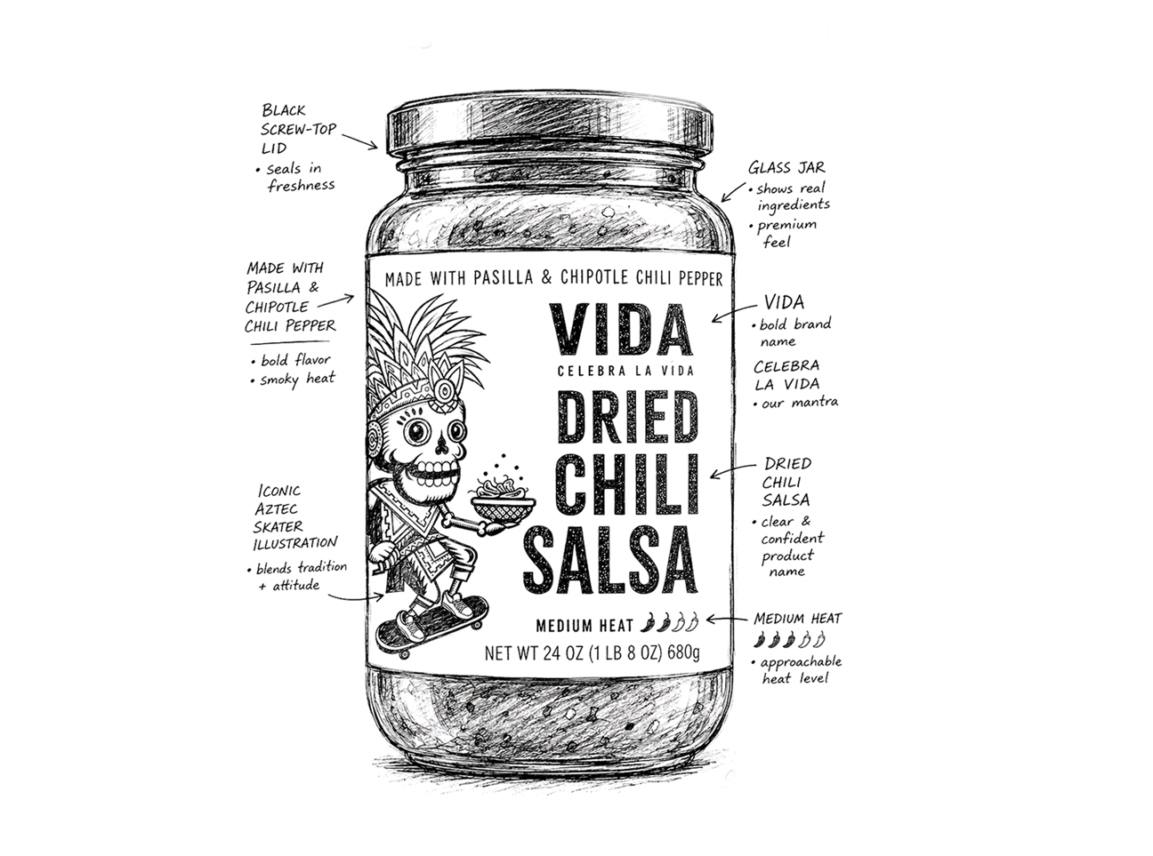
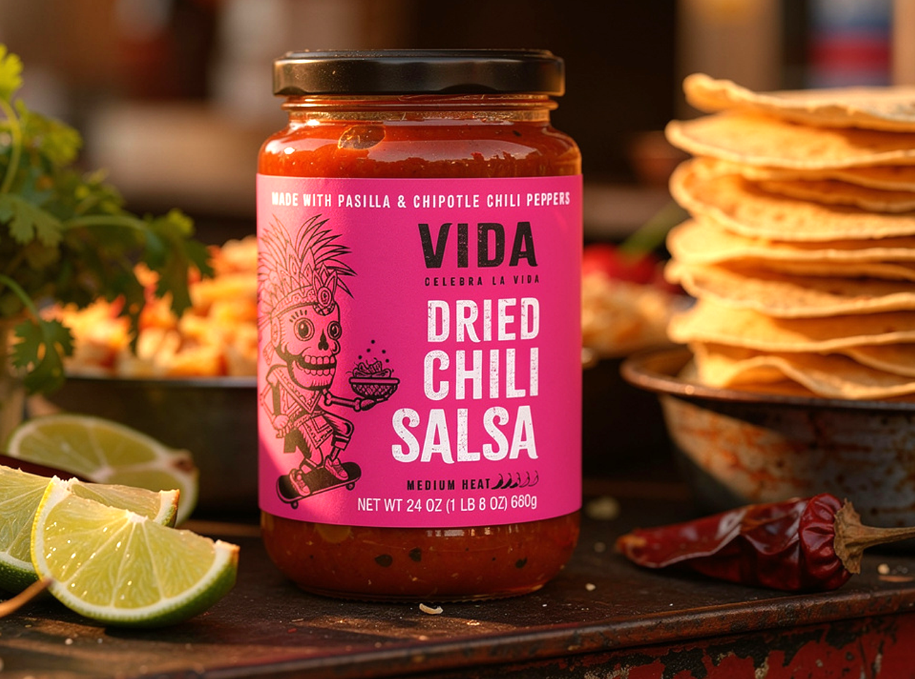
VIDA
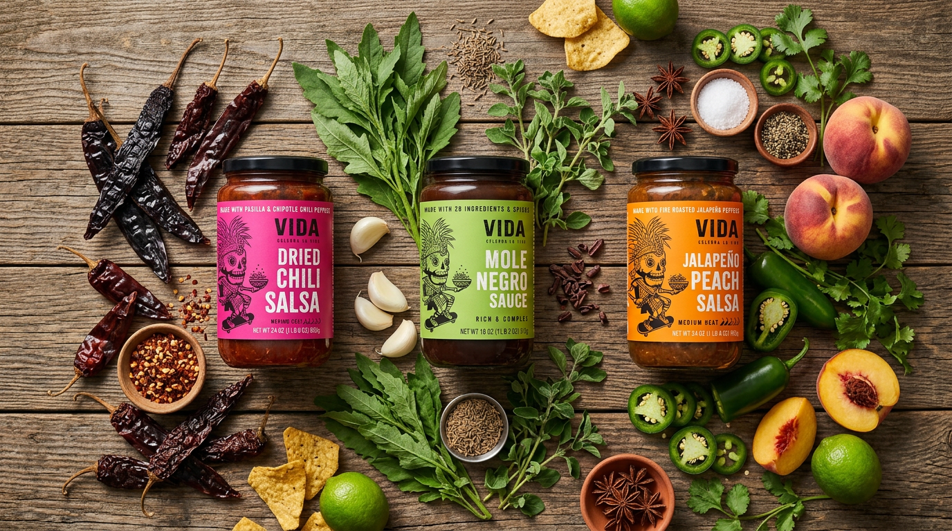
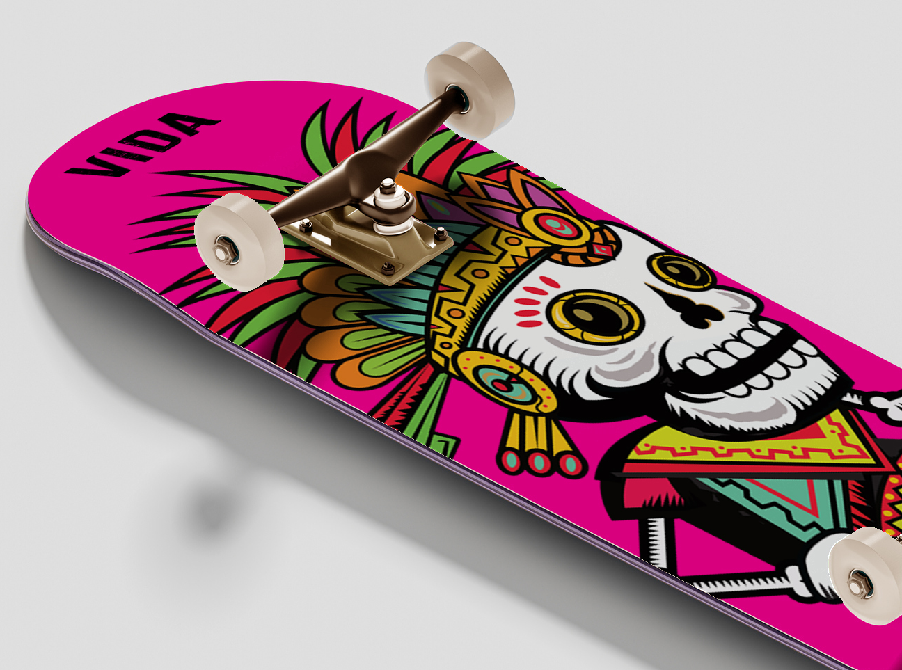
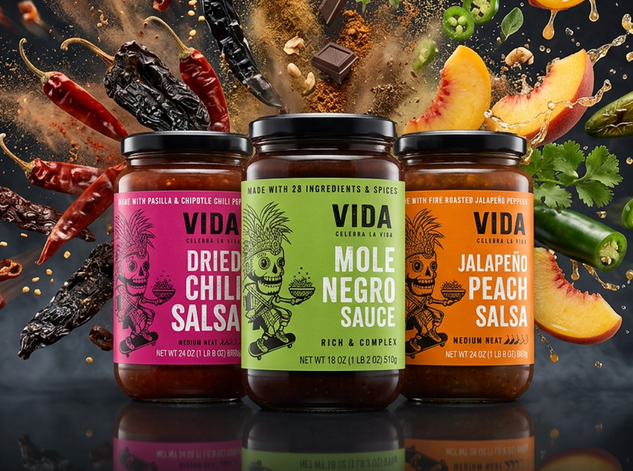
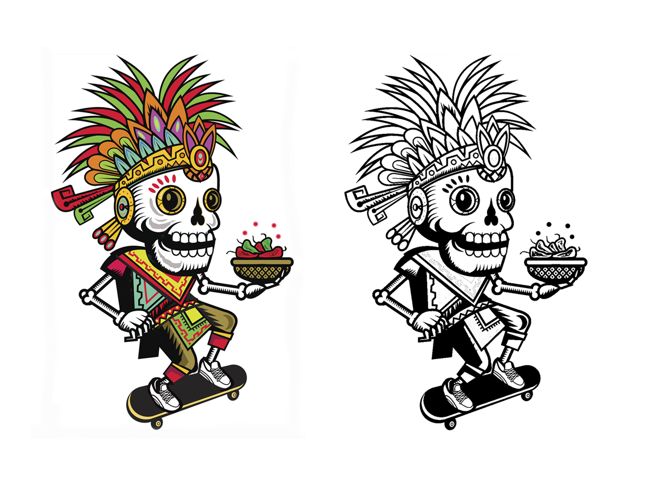
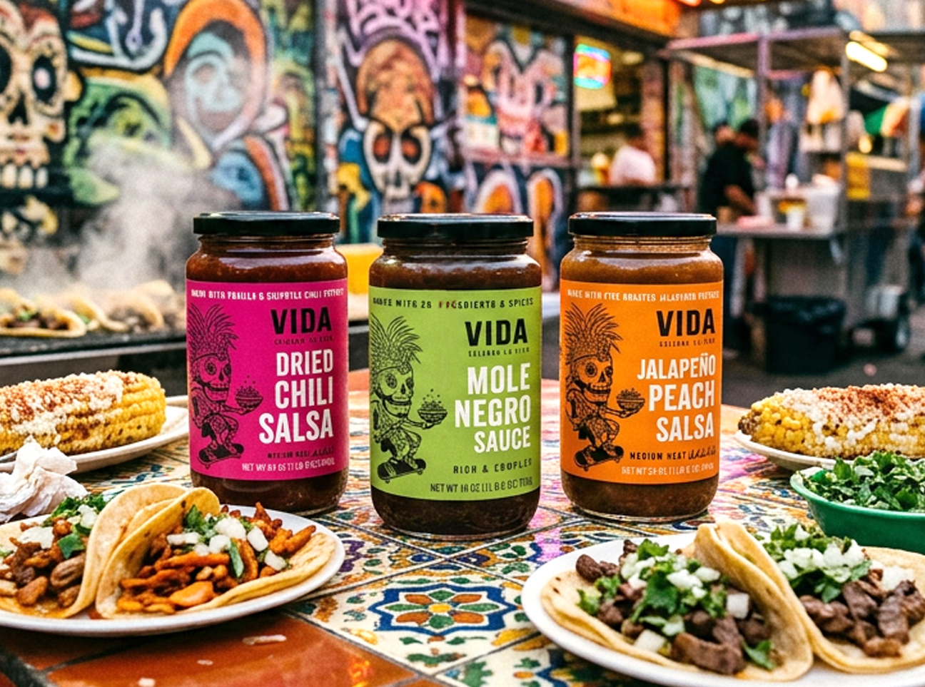
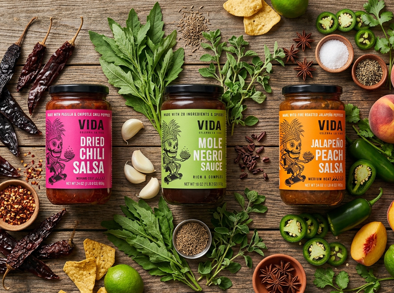
The objective was to create a brand for the launch of a new line of authentically inspired Mexican sauces and salsas. As everyone knows, the world of salsa can get pretty cluttered, so how do you stand out?
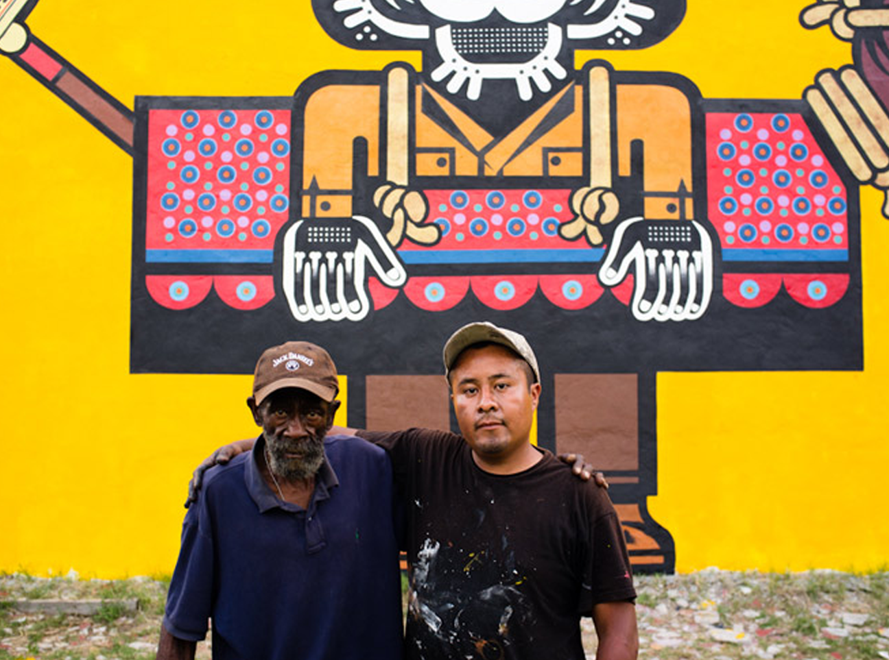
Embracing the fusion of modern Mexican street culture with authentic old-world tradition by commissioning Mexico City native and renowned street muralist Nuezz (Miguel Mijia) to develop a mythical character inspired by Inca folklore and legends.
The result: A successful launch into Costco
Activities: Competitive Analysis, Brand Design, Packaging Graphics, Merchandising, Website, Social + Digital Campaign
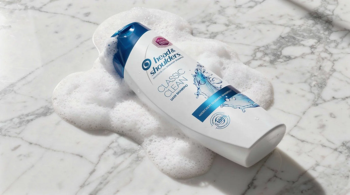
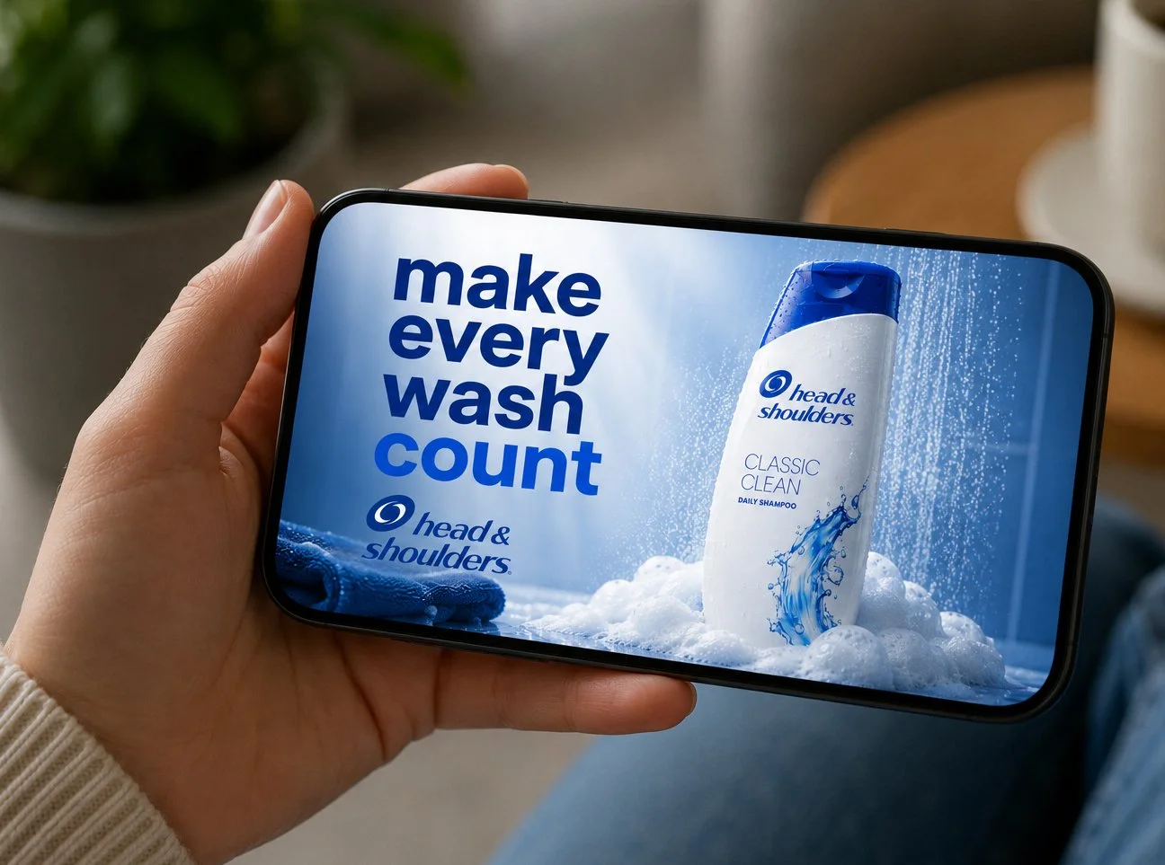
HEAD & SHOULDERS
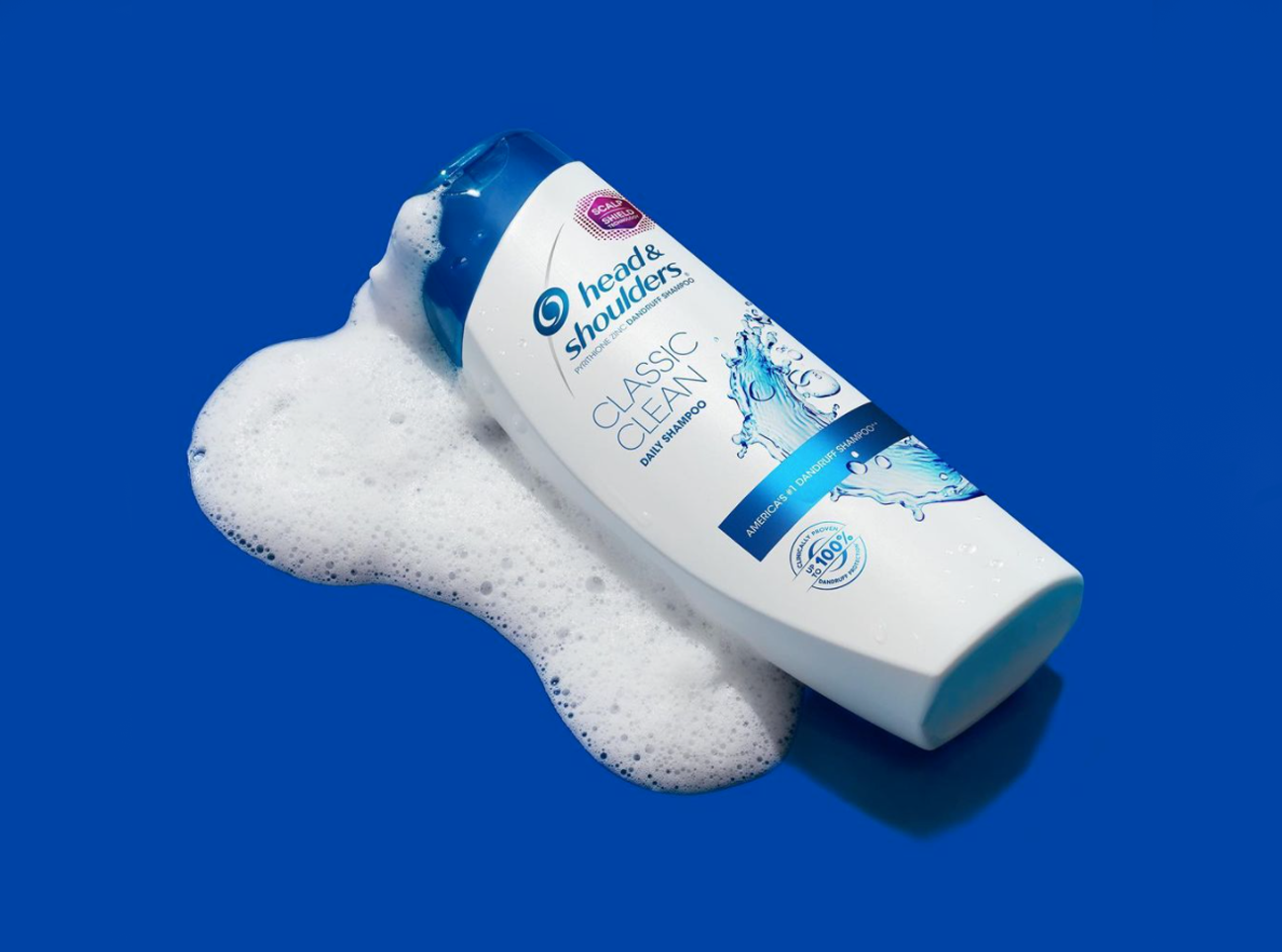
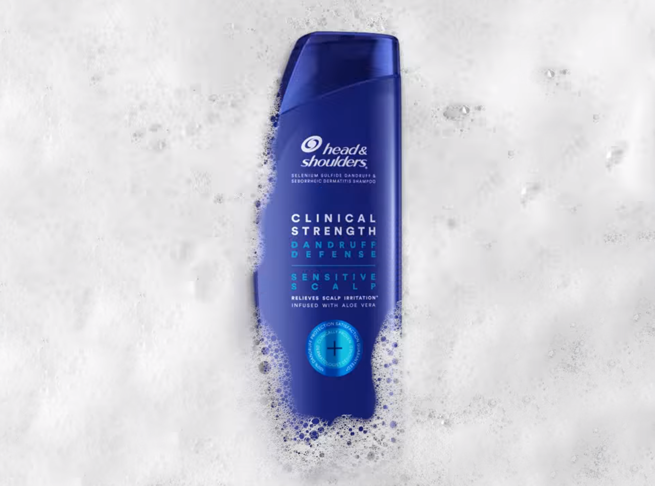
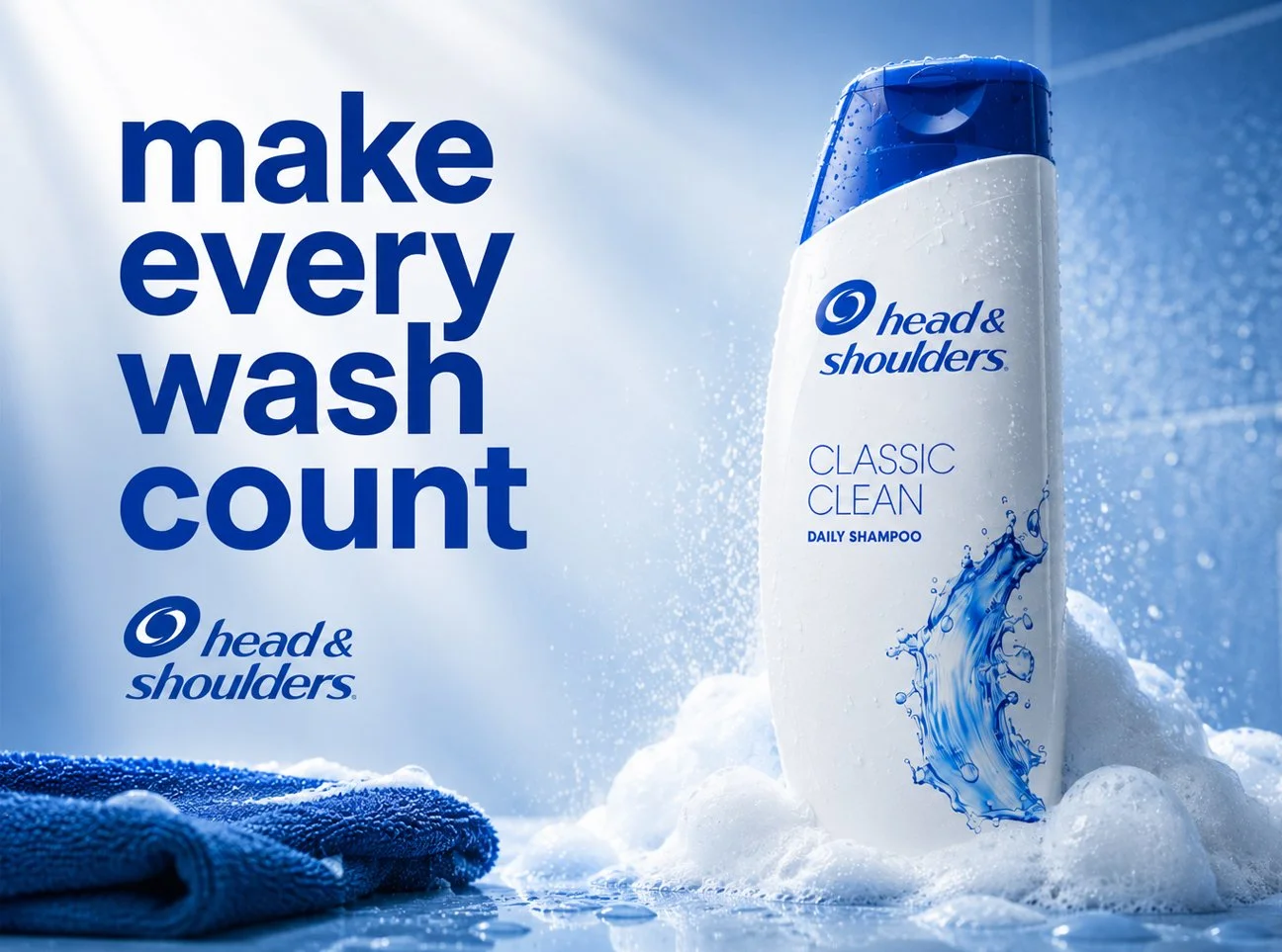
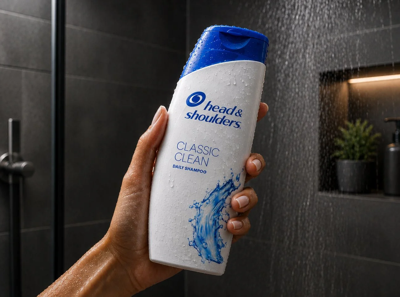
One of the most recognizable names in the health and beauty aisle was about to celebrate its 50th anniversary. To expand brand relevance on a national and global scale, the packaging needed to be radically contemporized
Through ergonomic studies, we developed custom bottle shapes that balanced shelf appeal, style, while improving functionality for the average female hand. We concurrently redesigned the brand identity to feel fresh and modern.
The result: Assisted in geographic global brand expansion.
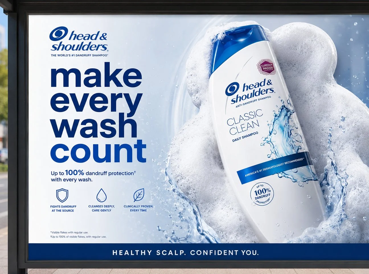
Activities: Competitive Analysis, Structural Package Design, Brand Design, Packaging Graphics, Advertising
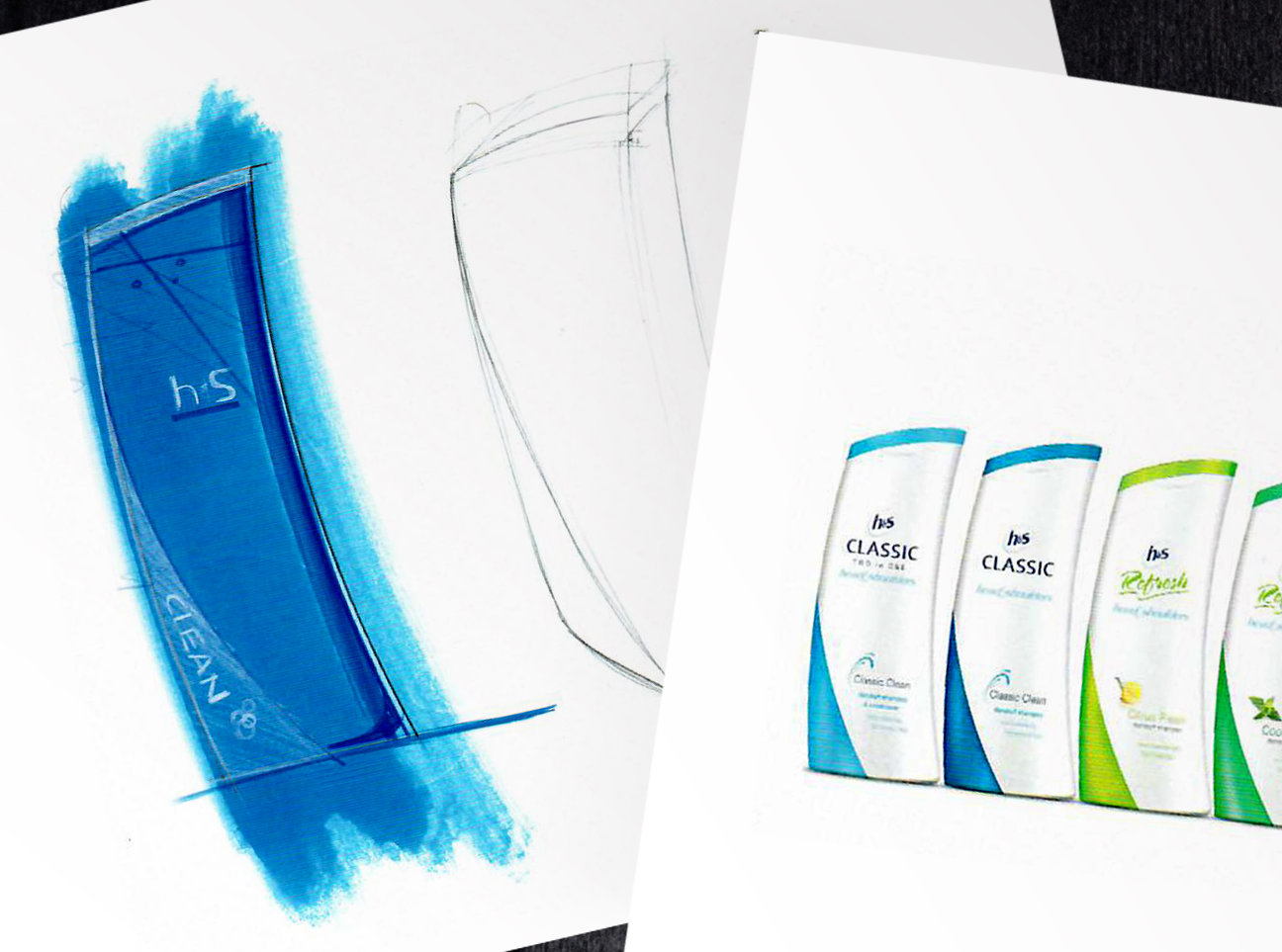
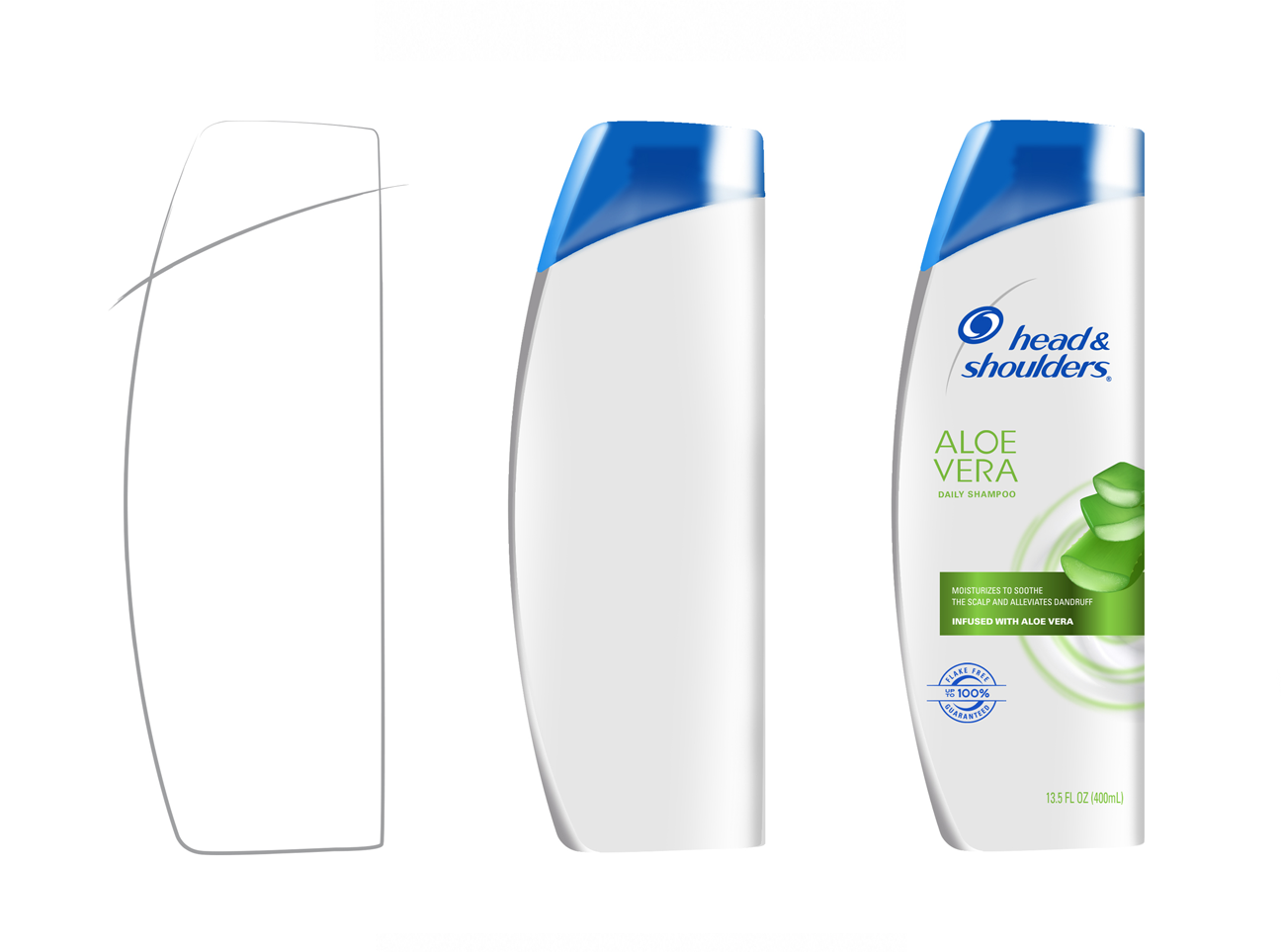
-
![]()
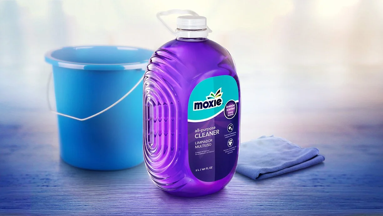
MOXIE CLEANING PRODUCTS
-
![]()
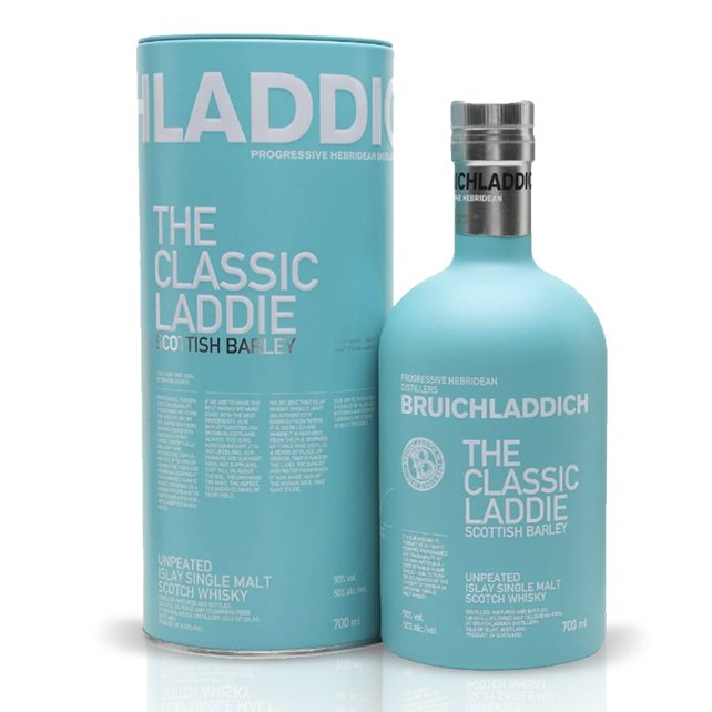
BRUICHLADDICH SCOTTISH WHISKY
-
![]()
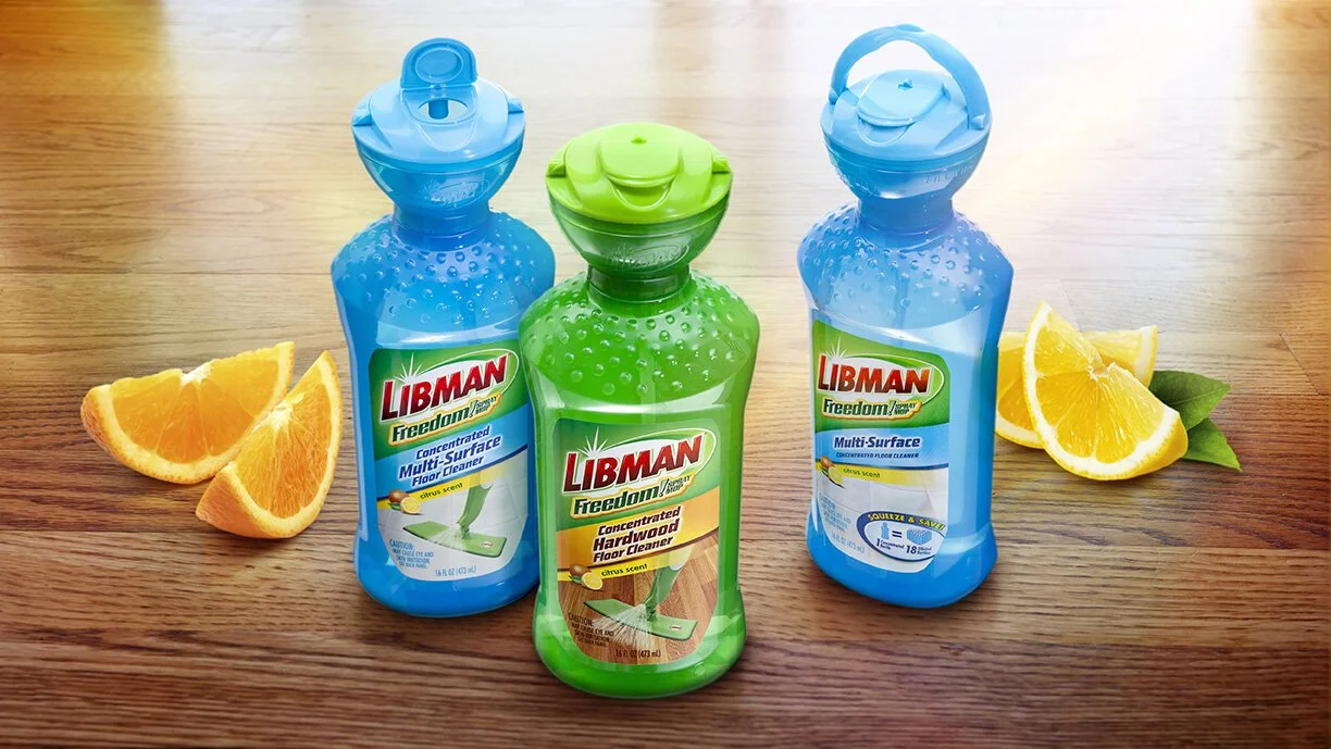
LIBMAN FLOOR CLEANERS
-
![]()
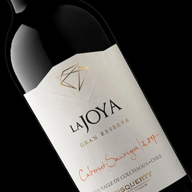
LA JOYA WINE
-
![]()
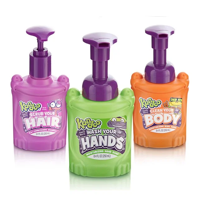
KANDOO KIDS HAND SOAPS
-
![]()
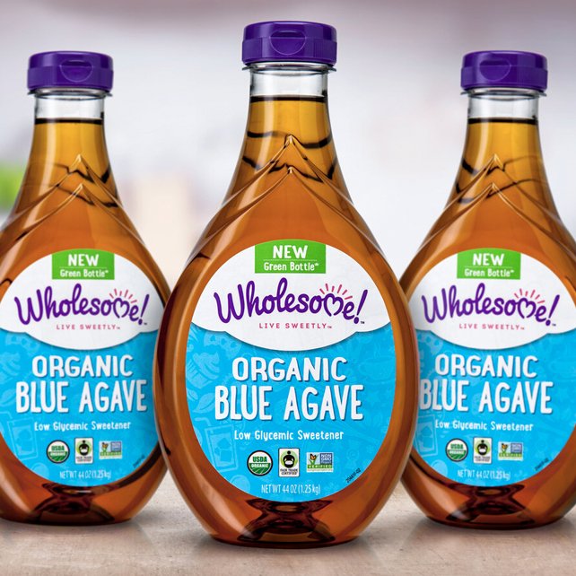
WHOLESOME AGAVE SWEETENERS
-
![]()
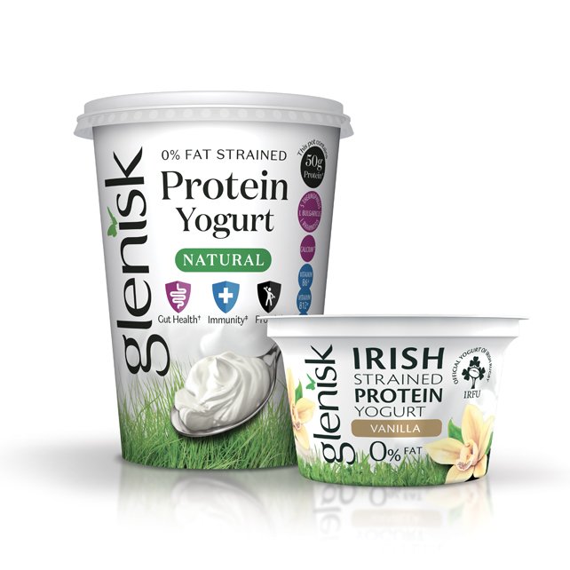
GLENISK DAIRY
-
![]()
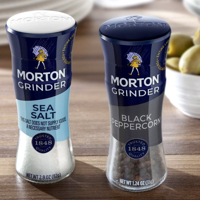
MORTON GRINDER
-
![]()
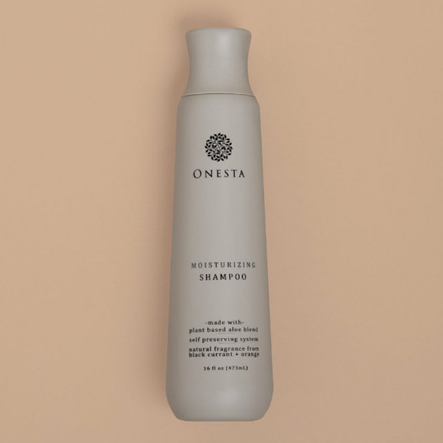
ONESTA PREMIUM HAIRCARE
-
![]()
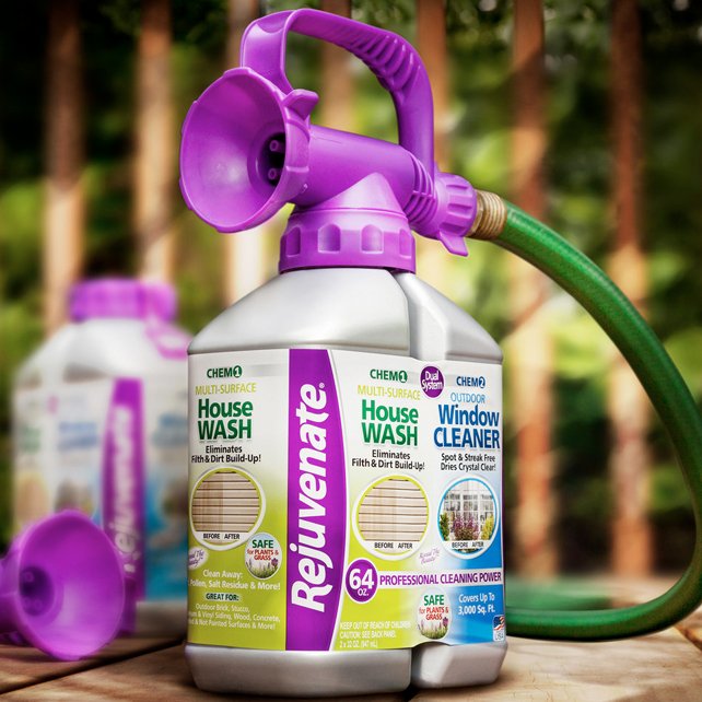
REJUVANATE
-
![]()
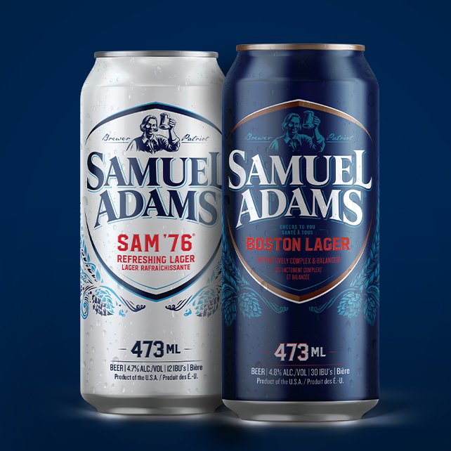
SAM ADAMS LAGER
-
![]()
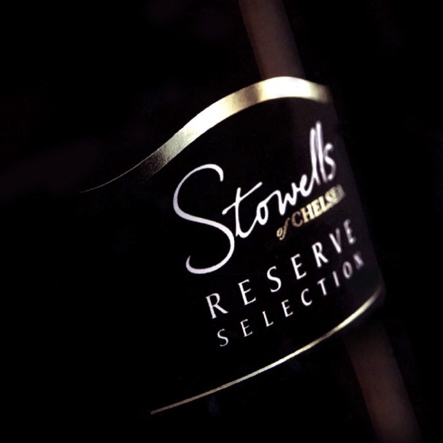
STOWELLS RESERVE SELECTION
-
![]()
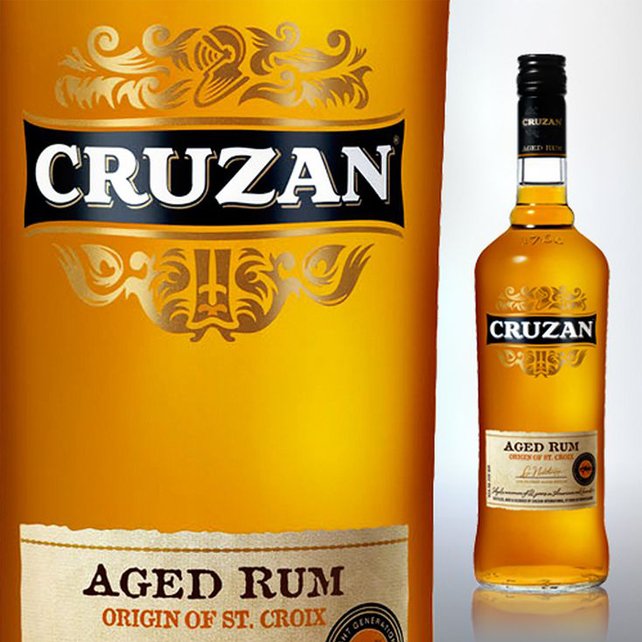
CRUZAN RUM
-
![]()
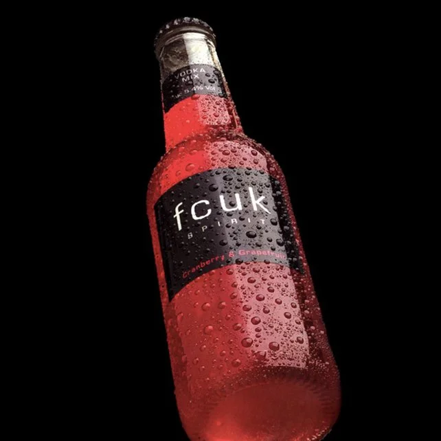
FRENCH CONNETION UK
-
![]()
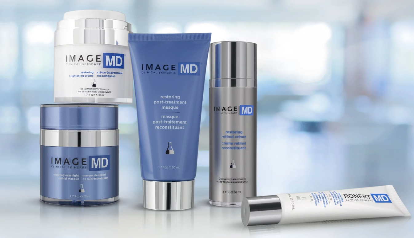
IMAGE SKINCARE
-
![]()
TRANQUINI
-
![]()
KENRA PLATINUM